Art Blind

The crowds, the booths, the noise – I just couldn’t take anymore.  And if you think I’m talking about the 127 Art Fairs that sprung up in New York this week, you’d be almost right.  The truth is, I was art blind before the fairs opened.  I was saturated.  I couldn’t stand to look at any more anything.  I couldn’t have one more conversation about process versus content.  So although I should have gone to at least 113 of them, I didn’t.

Where DID I go?  Coffee Fest!  The coffee trade show at the Javits Convention Center.  Numbered booths, crowded aisles, overstimulation of my already overtired eyes; it might as well have been an art fair.  Or a gift show.  Or the GLBT convention with which it was sharing space (at least they had blow-up palm trees and colorful balloons).

IMG_0312

Trade shows are trade shows, I’ve decided.  And art shows are just as full of hucksterism and gritty commercialism as any other trade show.  There is no pretense that they are doing anything other than selling as much of their interchangeable inventory as possible.  No wonder the galleries don’t want the artists to come.

But back to Coffee Fest.  My sister Jennifer Cook owns a wonderful independent coffee shop in Katonah, NY (NoKa Joe’s – go visit.  She has a bookstore upstairs!).  And she needed to see what was new in coffee and coffee accessories, so I went along with her and her photographer/beekeeper friend Karen Sabath.

AND happened to arrive just in time for the finals of the Latte Art World Championship.  Proof that there is no escaping art.  The barristas impressively produced their championship cups in front of a live audience (try THAT Art Fairs!) and then we all got to sample the products (ditto!).  Coffee, tea, protein shakes, smoothies, scones, muffins, shortbreads, biscotti, and, oddly, lots and lots of oatmeal.

On the way out of the Javits Center, just in case you weren’t already buzzed from the caffeine and the sugar, there was a Starbucks doing bang-up business.  It was a perfect end to spring break.

Matisse at the Met

Still Life with Compote and Fruit, 1899

Still Life with Compote and Fruit, 1899

For years I have considered myself a Matisse-ophile, a mega-fan, an acolyte. So I’m a little surprised at myself that it took so long for me to get to the big Matisse show In Search of True Painting at the Metropolitan Museum of Art.

Once there I was surprised again to find that there were plenty of Matisses that I didn’t like.  Apostasy!

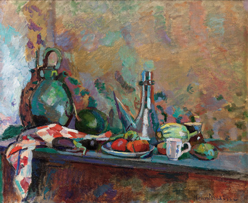
Still Life with Purro, 1904

Still Life with Purro, 1904

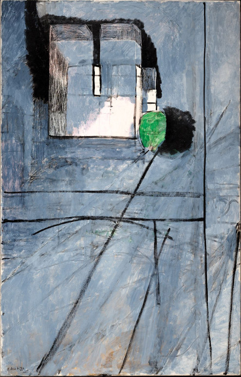
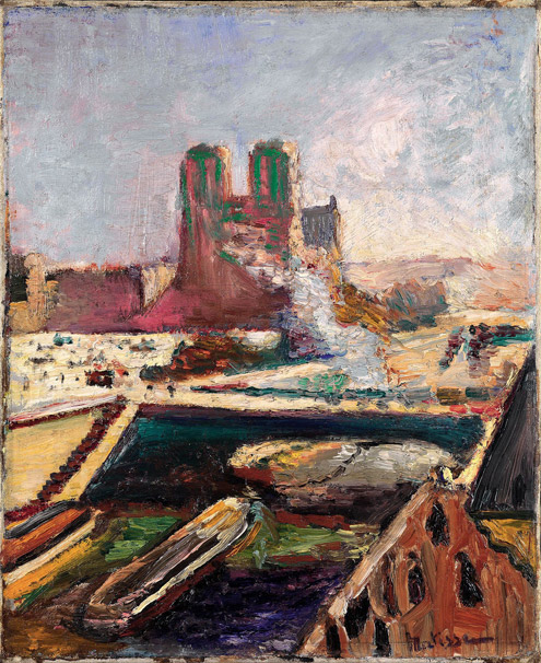
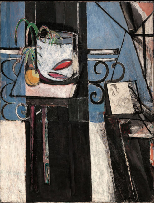
The show is cleverly organized by Rebecca Rabinow, Curator in the Museum’s Department of Modern and Contemporary Art, to show the viewer not just the amazing paintings, but the art-making struggle that Matisse undertook to make his masterpieces.  Two of the great revelations of the show (at least to me) are Matisse’s creation of multiple versions of the same painting at the same time, and his use of photography to evaluate the progress of the paintings he was making.

Notre-Dame, 1914

Notre-Dame, 1914

This is where I would like to make a cogent case for MY working process as similar to Matisse’s, with (of course) similar results.  But I can’t be so ridiculous.  The only comparison I’m comfortable making is that we both occasionally use photography, and I’m pretty sure my camera is better.

Notre-Dame, 1900

Notre-Dame, 1900

It is my personal preference that favors his still-lives and his interiors over his figure paintings, which seem to fall somewhere between Van Gogh and Picasso, but without the vibrancy that Matisse would achieve later with his cut-outs.  Plenty of people prefer the figures to the apples, but they are wrong (again I am kidding).

Goldfish and Palette, 1914

Goldfish and Palette, 1914

The show runs through March 17th, and if you haven’t seen it yet, you should. It takes up eight galleries on the ground floor of the museum.  Turn left when you enter the great hall, stop and pay, then walk forward through ancient sculptures and turn right when you dead-end.  I only give you directions because I think the Met moves walls in the dead of night just to confuse me on my next visit.  And you might want to drop bread crumbs so that you can find your way out later.  Just a suggestion.

Interior with Goldfish, 1914

Interior with Goldfish, 1914

The museum website on the exhibition is http://www.metmuseum.org/exhibitions/listings/2012/matisse/introduction, and Roberta Smith’s exuberant review can be read at http://www.nytimes.com/2012/11/30/arts/design/matisse-exhibition-at-the-metropolitan-museum-of-art.html?pagewanted=all&_r=0.

Split Ends

If it were a horse race, the SVA MFA Fine Arts candidates would win going away.

Sara Mejia Kreindler


Rob Campbell

Rob Campbell


Brian Whiteley

For reasons only slightly known, apparently having to do with booking the gallery, the thesis shows (the class is divided into two shows) are held in January and February before graduation.

Nick Fyhrie

David Jacobs


Naormi Wang

Emily Langmade


I’ve just had my first look at the second thesis show, Split Ends, and was really impressed by the quality of work, the ambition and scale of the installation projects, and how different it is from the first thesis show, We Object.

Feng-Tsung Chan

Feng-Tsung Chan


Dongsuk Lee

Dongsuk Lee

This exhibition is primarily installation, sculpture, and video, while the first show was dominated by painting, drawing, and other flat media.

Keith Hoffman


Anna Costa e Silva

I’ve seen most of the Split Ends work develop over the year in the studio, and it is remarkably different when presented in a gallery – transformed by the space, and transforming the space in turn – in a way that doesn’t happen with paintings.

Kwantaeck Park

Part of that comes simply from having to unmake, move, and then remake found-object sculptures and assemblages.  Part of it is that in a new space the artist makes new decisions, again in a way that is unlike paintings.

Jamie Sneider


Denise Treizman

This show has dramatic lighting, lots of recorded voices and soundtracks, and impingement of art pieces on one another.  Or is that infringement?  Or collaboration?  In any case, it creates energy and a show that is worth experiencing.

The Visual Arts Gallery is at 601 West 26th Street, 15th Floor, and the exhibition remains up until March 9th.

Ates Ucul
Ates Ucul


Matthew Eck
Matthew Eck
Marc Bradley Johnson


Do You Remember When Art Was Fun – part 2

Polka Dots Make Me Happy

Polka Dots Make Me Happy

I was lucky enough today to spend time speaking with several of my classmates in school.  It’s cold and gray and wintry here in New York, and Seasonally Affective Disorder (SAD) seems to have swept through our studios like a depressed flu.

I can get revenge just by drawing you funny.

I can get revenge just by drawing you funny.


We were talking about the irrational art world in which we find ourselves living and working.   Critical voices surround us, pushing us, taunting us, making us doubt ourselves.  Often the most challenging faculty are the ones who force us to face new things and take chances.  We don’t enjoy it; it’s like being poked over and over again in sore spots.  But sometimes it works.  My anger and sadness are moving me to make art that is totally new for me.  I just don’t know if I like it.

Bad Day?

Bad Day?

The things we are praised for are crazy and unexpected.  Really?  You like that?  And we wonder: is that genuine admiration or is he pushing my buttons again?

Do you remember macaroni picture frames and woven potholders and pencil holders made of popsicle sticks?  What about the paintings we made in second grade that our teachers loved, and our mothers loved, that ended up proudly displayed on the refrigerator?  There was joy in that making.

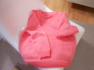
I relax by knitting.  No one criticizes my sweater.

I relax by knitting. No one criticizes my sweater.

All too often, for us grad students, joy has been replaced by doubt and worry. To say nothing of enormous debt.  But joy is what we need to find again.  Our joy is what will help us make authentic art that begins with what’s real inside us.  To hell with everything else.

If my next body of work is based on potholders, or rainbow paintings with glitter, don’t shake your head.  Congratulate me.

What is the Opposite of Angry Art?

I was attending a Critical Theory discussion group moderated by art critic Charles Marshall Schultz when we got on the subject of angry art.  Or more specifically, the opposite of angry art.

Tricia ClineThe Search for Mouse, 2012
Tricia Cline
The Search for Mouse, 2012

Is there hopeful art?  Grateful art?  Has any iconography taken over this position since Madonna and Child, in all its variations, fell out of favor after the Renaissance?  Is there hopeful or grateful art that is not religiously based?

Tricia Cline and Toc Fetch
Installation View
Ricco/Maresca Gallery

Angry art is easy to make and recognize.  So is serene or peaceful art.  Even joyous art.  But hopeful and grateful imply more complexity.  A history of pain that has been eased, perhaps.  A life that has been improved.  A change of attitude toward the future.

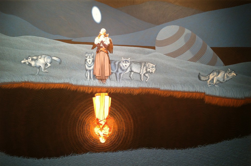
Toc FetchThe Exile Returns When Needed
Toc Fetch
The Exile Returns When Needed, 2012

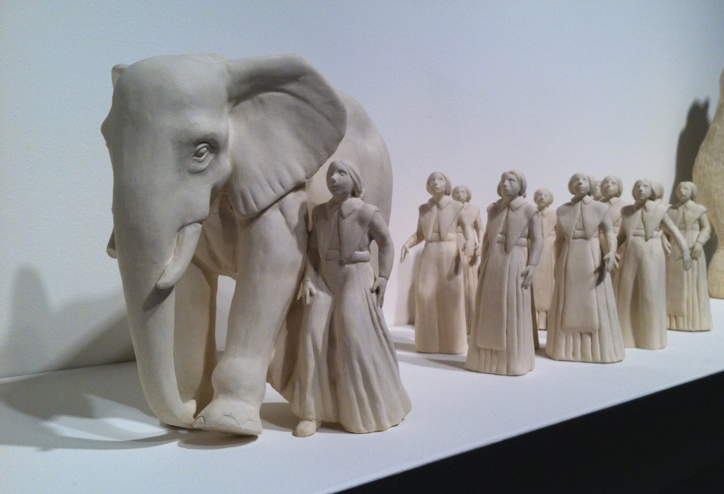
I have maintained for years that I could not picture grateful art, and then I walked into Ricco/Maresca Gallery (529 W 20th) on Saturday and found it surrounding me. The show is called Mythology, in which sculptor Tricia Cline and painter Toc Fetch have created a world of pilgrimage and self-realization that leads to self-awareness.  The viewer taking the pilgrimage may not feel gratitude himself, but surely he sees it in the sculpted and painted protagonists of the artwork.

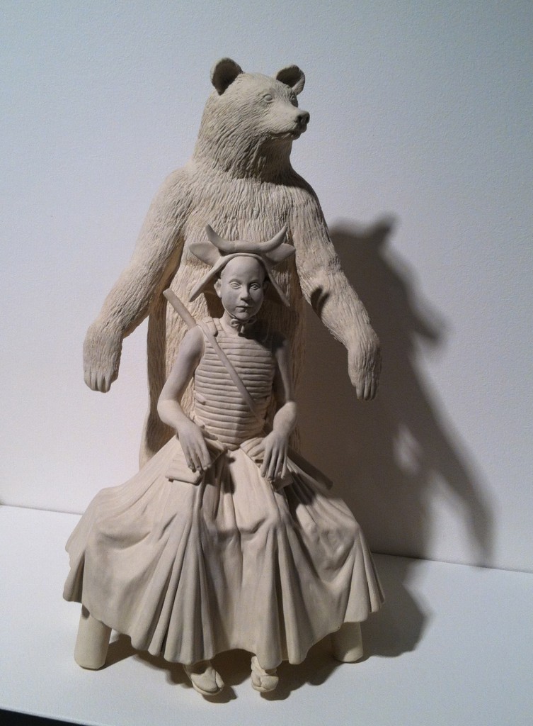
Tricia ClineUrsula and Her Kid
Tricia Cline
Ursula and Her Kid, 2011

The small porcelain sculptures by Tricia Cline are beautifully realized, but odd enough that they never invoke the kitsch that your grandmother collected.  Almost subversively, the shadows cast by the sculptures give them the grandeur of life size.  And Toc Fetch’s paintings, especially The Exile Returns When Needed, deal with light masterfully.  That otherworldly glow helps create the feeling of hope, at the same time that it points to the possibility of hope within all of us.

My special thanks to the Gallery, which is warm and welcoming to visitors and has surprised me twice now (last month: Henry Darger!) with quiet, meaningful, emotionally rewarding exhibitions.  This one runs through March 16th.

Jean-Michel Basquiat – “It’s About 80% Anger”

There was a time I thought Andy Warhol could have been a little more careful with his paint application.  And I thought Jean-Michel Basquiat was a talentless scribbler.

f1838d15f99399812b1f021f3117bce0
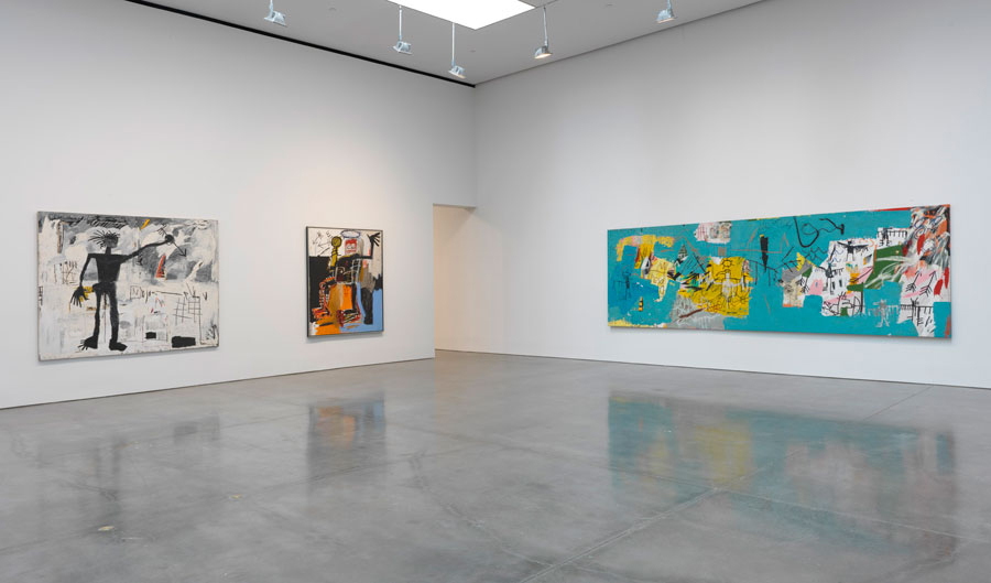
Installation View
Jean-Michel Basquiat at Gagosian
Untitled (L.A. Painting), 1982, on right

Which is only to say that I remember them alive and working, and that I spent much of my earlier life being stupid.

When Andy Warhol, who had a life-long fear of hospitals, died in one unnecessarily while his private nurse slept on duty, my heart broke a little for the sad irony.  And when Basquiat died the following year, of heroin and his own Warhol-broken heart, his art finally came alive for me.

Basquiat, In Italian, 1983
Basquiat, In Italian, 1983

Today I count myself lucky that from the societal margin of my high school and college days I lived a little bit of the Warhol era.  Today if someone compares my work to Warhol’s (unless what they’re saying is something like, OMG Andy Warhol would have hated your work), my heart sings.  No one compares my work to Basquiat’s, but I wish my work were good enough to encourage that.

Basquiat, Untitled, 1981
Basquiat, Untitled, 1981

Warhol, who was born the same day as my father, died in 1987 at the age of 58. Warhol’s reputation was long established – he was a game changer, an art-world phenomenon, and a genius at self-promotion.  But all of that only mattered because the art was genius, too.

Basquiat died at 27 in 1988.  He had been a street kid with a natural talent whose comment on his own art was, “It’s about 80% anger.”  The raw emotion of his work has not only stood the test of decades (this year will mark the 25th anniversary of his death), it still has an immediacy that is fresh today.

I am just back from Gagosian’s Chelsea Gallery, where more than 50 Basquiat works have been put on display.  (http://www.gagosian.com/exhibitions/jean-michel-basquiat–february-07-2013)  Although the opening was last week, the gallery was packed.  And room after room after room are full of Basquiat’s anger, his scribbling mark-making, his comments on racial inequality, and his amazing, stunning use of color.  What courage it must have taken him to pour out his soul in the face of criticism and the fickleness of “experts”.  It is not just the paintings that make me want to cry, it is the story of the lost boy who gave us so much and then gave up on life.

Basquiat,Untitled (Two Heads on Gold), 1982
Basquiat,
Untitled (Two Heads on Gold), 1982

For me, Basquiat and Warhol are forever friends and collaborators – the influence of each obvious on the other.  The influence of each obvious on me and on artists everywhere.

Out and About

Zarina Hashmi, Blinding Light

Zarina Hashmi,
Blinding Light

I spent part of this afternoon at the Guggenheim where I was disappointed not to be able to walk the ramps because they were installing a new show in the empty middle air.  But they did have an interesting exhibition on the fourth floor by Zarina Hashmi, a New York artist who works primarily on hand-made paper (hence the show title: Paper Like Skin).

I was reprimanded only once for standing too close, which is amazing, because her work demands a literally closer look.  It’s a combination of “how did she do that?” with “what is that?”.

Zarina HashmiCage

Zarina Hashmi
Cage

She is using sawn pieces of wood to make woodcut prints (not carved wood, just natural pieces of driftwood, or fallen branches).  She has done the same with patterns of twigs and reeds.

Zarina HashmiUntitled Relief Print

Zarina Hashmi
Untitled Relief Print

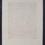
A large collection of “pin paintings” is presented in which Hashmi has punctured her paper in a predictable regular manner – but the hand of the artist can still be seen. Those are in direct contrast to a thread painting, in which the thread pierces the paper in a mathematical grid, but the tail ends are left to fall randomly in an accidental pattern that is fascinating.

The deliberate allowing of chaos into an artist’s work is a difficult choice and an even more difficult plan to implement.  How, after all, to plan for chance?  It is a very fine line to walk: where to control and where to let go.  It is only when it is working that it looks easy.

Zarina HashmiUntitled (Pin Drawing)

Zarina Hashmi
Untitled (Pin Drawing)


Zarina Hashmi,Untitled (Lithograph and Thread)

Zarina Hashmi,
Untitled (Lithograph and Thread)

Hashmi’s work is quiet but intelligent and thought-provoking, at least for me.  I may have started out looking at her work and asking “how” and “what”, but I ended up asking “why”, which is a far more interesting question.

Studio/Gallery Visits

Color ShiftInstallation View atMixed Greens

Color Shift
Installation View at
Mixed Greens

I have friends who love new people.  They are true extroverts.  Secretly I hate them.  No, of course I don’t.  But I’m jealous.  They make it look so easy, so fun.  New people.  Yay!  Let’s talk about art!  Let’s talk about you!  Let’s talk about me!

I am old enough that I have learned how to meet people, and speak to groups, and discuss my work and my background.  And I am truly interested in others, their opinions, and their lives.  But it’s difficult for me.  I’m an introvert and sometimes the right words won’t come.

I like to think that when artists, or experts, or even my own faculty come to visit me in the studio that I handle it gracefully, and that panic does not plug my ears past the point of hearing what caring people say to me in the genuine hope of helping me and my work progress.  And that hearing them, I respond appropriately, without ego, to gain the most from their visit.  I like to think that.
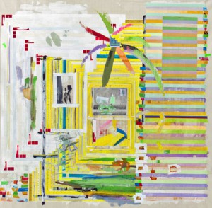
Yellow Rules White and RedFranklin Evans, 2012

Yellow Rules White and Red
Franklin Evans, 2012

I would like to thank Kathleen MacQueen, art critic and writer of the column Shifting Connections (http://shiftingconnections.com) who visited me a couple of weeks ago.  Her insights on my use of multiple versions of the same image were extraordinarily helpful.  And last week artist Franklin Evans (http://www.franklinevans.com), whose work I admire, also visited me and helped me with a sticky issue I was facing about layering images and hiding meaning in pattern.
 

We Have Pictures Because We Have WallsArabella Campbell

We Have Pictures Because We Have Walls
Arabella Campbell

On Wednesday, I was lucky enough to receive a visit from Heather Darcy Bhandari, Director, and Courtney Strimple, Exhibitions Coordinator, from Mixed Greens Gallery.  http://mixedgreens.com/exhibitions.html From them I learned that I was doing some things right, but that I should have edited the work I had on display.  And there were other things that weren’t working, like the black-line drawings that underpin many of my iPad sketches.

Heather Darcy Bhandari is also the co-author of the invaluable book Art/Work, which is used as a text in business of art classes and serves to clue in clueless artists about how the gallery world works and how we should behave in it.  One cannot possibly overestimate how clueless we are.
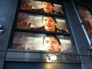
Matthew De LeonWindow Dressing

Matthew De Leon at Mixed Greens
Window Dressing

All of which is my incredibly roundabout way of getting to the point that yesterday, having walked in pelting hail to the SVA Gallery on West 26th to drop off an application-for-exhibition package, I found myself looking up at the Mixed Greens exterior, whose windows are currently displaying enormous photographs of Andrew McCarthy from the movie Mannequin.  I will not admit that it lingers quite strongly, but I used to have SUCH a crush on Andrew McCarthy.  The narrative behind the window installation is meaningful (check it out on the website), but it needn’t be since the visual image alone is quite powerful.
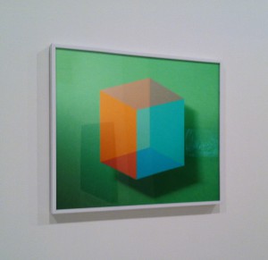
Zachary Dean NormanPlatonic Solid

Zachary Dean Norman at Mixed Greens
Platonic Solid #2

Inside the gallery I was at first put off by the simplicity of the space and the spareness of the group show currently on display.  But I wandered around and looked more closely and slowly began to get it. The art is about art.  In the simplest possible way it makes its point that we in the art world spend a lot of time talking (and writing) about art, but the bottom line is looking at it and seeing what it says without words.  It is a very witty show, which grows on you as you walk until you’re smiling at the walls.


I want to thank Mixed Greens for providing images on their price lists.  And prices, actual prices, for art work that is for sale.

Sherwin Rivera TibayanInstallation View #2 (MoMA, Blue Monochrome, 1961, Yves Klein)

Sherwin Rivera Tibayan at Mixed Greens
Installation View #2 (MoMA, Blue Monochrome, 1961, Yves Klein)

I am very grateful to the artists, and experts, and faculty who come to my studio to help me make better art, probably not knowing that I am quaking with fear inside.  If I wait too long to answer you it is because I am afraid and because I get stuck in my right brain, where there are no words.  So let me say it here: your visit means the world to me.

On Tuesdays We Silk-Screen

If you know anything about printmaking then you’re ahead of me, even though I’m five classes into a semester of silk-screening.  As with many new skills I try to acquire, I begin with some small competence and get worse from there.  Today’s work began with a good idea which was not successfully realized in the prints, so I’m back to the drawing board.   Who knew that emulsion would be my nemesis?

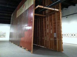
Roth worksurface hung vertically

Dieter Roth work surface hung vertically

But during the many periods while I was waiting for my emulsion to dry (it takes about 15 minutes if you do it right, which I didn’t) I realized several things.  First, I am unused to any kind of art-making in which I have to wait. Even when I paint in oils and should wait, I usually don’t. Second, our teacher, Charles Yoder (http://www.charlesyoder.com) is a master printmaker who knows, or knew, everyone important in printmaking in the last several decades.  When he drops names, I listen.  Today he showed us books of Warhol prints, and Chuck Close prints, and Dieter Roth prints. Which is when he reminded us of a new Dieter and Bjorn Roth exhibition at Hauser & Wirth gallery in Chelsea (511 West 18th).

http://www.hauserwirth.com/exhibitions/1649/dieter-roth-bjorn-roth/view/.

Roth's column of self-portrait busts in chocolate

Roth’s column of self-portrait busts in chocolate

After class, with my sleeves still wet from washing my screen, and ink still under my fingernails, I headed out to West 18th Street to see the Roth show.  Dieter Roth had a long career and was serially famous for making many things, including installations, food art, videos, assemblages, and prints.  He finished his career by collaborating with his son Bjorn.   This exhibition was created under the direction of Bjorn Roth and his two sons, Oddur and Einar. Hauser & Wirth has a very large space and has installed examples of all of the Roth genres, as well as two enormous floors (vertically) and an installation that looks suspiciously like Roth’s own studio.

Roth, The Floor I and The Floor II

Roth, The Floor I and The Floor II

Well, why not.  When Andy Warhol was asked, “What is art?” he replied, “What isn’t?”

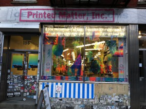
On my walk back home, I passed Printed Matter, Inc. (195 Tenth Avenue) http://printedmatter.org/about/ which sells not just art books, but books that are art. There in the window was a print installation by one of the teaching assistants from my silk-screening class, Panayiotis Terzis. www.pengoat.com.  It was eye-catching and fun.  I’m pretty sure he’s got the emulsion thing down.

Panayiotis Terzis Installation at Printed Matter, Inc.

Panayiotis Terzis Installation at Printed Matter, Inc.

The art world is huge and intimate at the same time.  Lucky me.

The Review Panel

If you like art criticism, but wish there were more fisticuffs, then the Review Panel is for you. It’s like cage fighting for art critics.

Moderator David Cohen

Moderator David Cohen

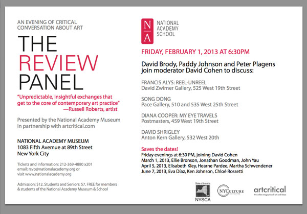
Last night I attended the February meeting of the Review Panel, which is a monthly program sponsored by artcritical.com and the National Academy Museum.  Picture three critics on a dais, facing an audience of about 100, put on the spot by moderator David Cohen as they express their opinions of four current exhibitions.

It’s delicious to watch them disagree politely and deferentially while they deliver their barbed comments.  The loser is the one who ends up trying to defend an unpopular position after the legs have been pulled out from under it by the other critics. Will he crumple or maintain a brave front?

Moderator David Cohen (www.artcritical.com/author/David/) is a master of dry British understatement as well as editor and publisher of artcritical.com.  Last night he was joined by painter and critic Peter Plagens (www.peterplagens.com), artist and critic David Brody (www.david-brody.com/index.html), and critic Paddy Johnson (www.artfagcity.com/about/).

They reviewed the Francis Alys video Reel-Unreel, which I’ve discussed already, Diana Cooper’s show at Postmasters (ditto) and two other shows that I’ve already forgotten.  There were no fireworks, although first-time panelist Paddy Johnson was the minority vote on artists Diana Cooper and David Shrigley.  (Okay I lied.  I remember the show.  I just didn’t like it.)

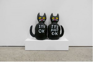
David Shrigley

David Shrigley

The first time I attended the Review Panel, there was a priceless moment when New York Times critic Roberta Smith told moderator David Cohen that he didn’t see enough art and was just “ignorant”.  It was a jab-cross-uppercut combo, although she did apologize later in the evening.

One of the best things about the Review Panel is the ability to see and hear articulate critics discuss emerging and established artists in plain English instead of artspeak.  If you miss the monthly event, go to www.artcritical.com to listen to the podcasts that are posted afterward.  You can also sign up for emailed reminders.

In the “real” world, art hardly matters, and art criticism matters not at all.  But anytime that thoughtful, well-educated people get together to talk, argue, and persuade is an event I don’t want to miss.