Excuse Me!

I was at the Metropolitan Museum of Art yesterday for exactly two hours between business meetings.

IMG_1623IMG_1669

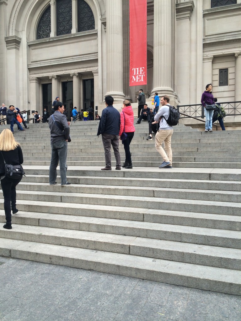
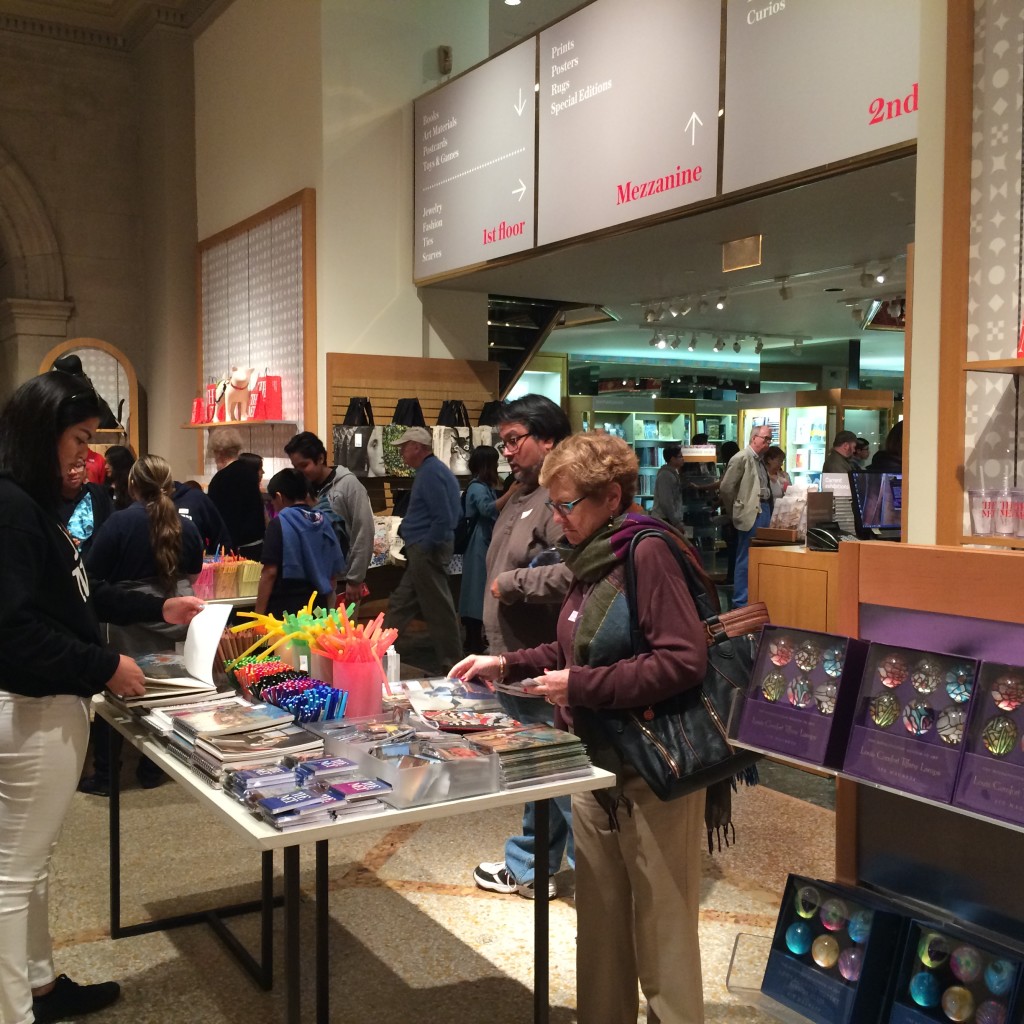
The Museum was jammed full of people and, quite annoyingly, children.  They were told to use their “museum voices”, but they didn’t.  It was like looking at art with flocks of chirping birds. And they swarmed in front of the Chuck Close so that I couldn’t take a selfie.

Then there were the French speakers.  Do they really need to show off their proficiency in French?  Don’t they know that I have tried to speak French since sixth grade and can still barely manage the present tense?  They need to understand one thing about America: it’s all about me.

Being at the Met is unlike any other museum experience.  One must visit old friends.  Always first for me in my youth were the mummies.  I remember when I was a kid, they were in cases in the hallway.  My brother and I would hang over the cases and nudge each other with our elbows.  But yesterday, I couldn’t find them.  Plenty of mummies in wrappings.  Who wants those?  I like the gruesome unwrapped kind.

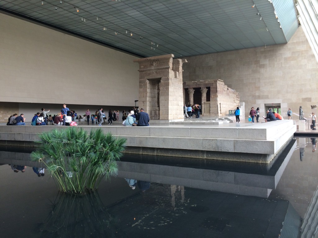
Second, the Temple of Dendur.  It sits surrounded by water, overlooked by huge glass panes – it is a wonderful place for contemplation.  As long as you’re there with just a few other like souls.  And I wasn’t.

IMG_1668

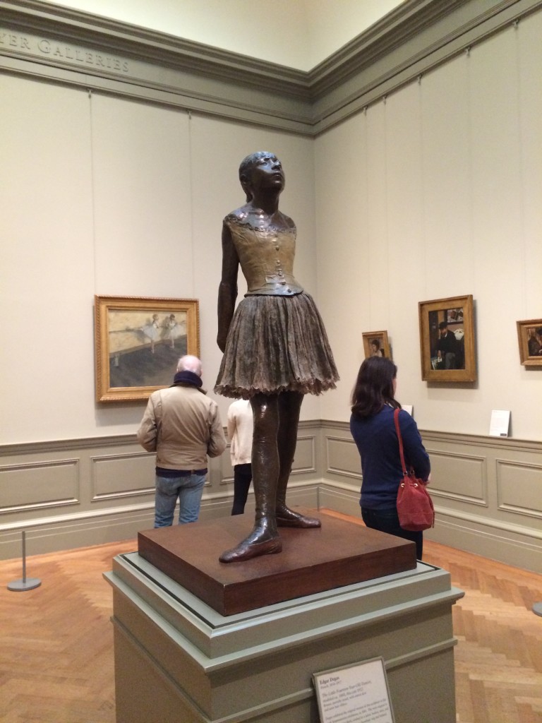
So – off to see Degas’ The Little Fourteen-Year-Old Dancer.  I had to shove my way to the front.

IMG_1673

Then the Impressionists, the rest of the Europeans, the Americans, and the Moderns.  One large group of chickadees immediately recognized a Jackson Pollock, then sat down in front of it to discuss.  I tried to hear their teacher, but she was using her museum voice.  You’re in my way, small people!

IMG_1626

I had lunch in one of the Museum’s cafes.  I was at a table for two, facing the window, when I realized that there is too much Mafia in me to stand for that, so I moved around to face the room.  I got to watch as the bar seats filled up with single women and there was a silent power struggle over where to put the purses of the left-handers versus the right-handers.  My grilled asparagus salad was delicious.
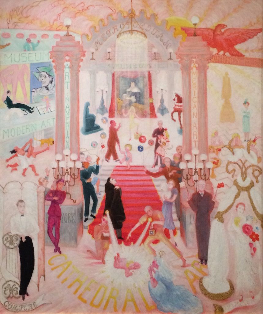
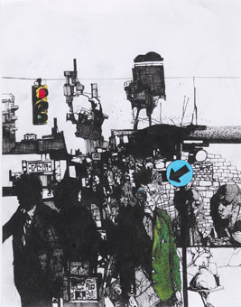
Florine Stettheimer The Cathedrals of Art 1942

Florine Stettheimer
The Cathedrals of Art
1942

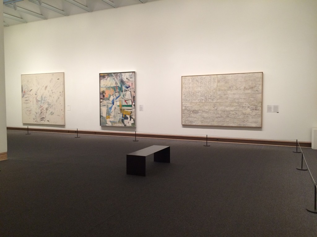
There were several galleries that were roped off and the woman I spoke to said there weren’t enough guards to protect them given recent budget cuts.  My solution?  Cut the docents for children and bring back more guards.  I want to get closer to that de Kooning!

IMG_1634

At one point, a crabby guard yelled (not just at me, I’m sure, probably) that if I wanted to get a closer picture I should use my zoom.  My phone camera has a zoom?

And now I feel like painting children.  Flocks of children with their little tiny mouths closed.  Les bouches de Botero.  (Feel free to correct my French.)

NOT at the Met!

NOT at the Met!

Art is Hard

It’s harder than I thought to make art WITHOUT a deadline. Previously, I thought it was hard to make art ON a deadline. Apparently, making art is hard.

Knitting doesn’t count. Baking cookies, no matter how beautifully decorated, doesn’t count. Among other things that don’t count are house cleaning, gardening, reading murder mysteries, going to the movies, grocery shopping, and MY DAY JOB! These are all wonderful things to do, or to have done, but they are not making art.

I was inspired recently when I attended a lecture at Lyme Academy by Professor Emeritus David Dewey, with whom I studied watercolor several years ago. His paintings are glorious, and his book on watercolor technique is a classic, but what really struck me when he spoke was how much preparation work he does for each painting.

David Dewey Marshall Point: Bridge to Light With Compositional Drawing, 2013

David Dewey
Marshall Point: Bridge to Light With Compositional Drawing, 2013

Sometimes he does ten or more color studies. Sometimes it takes weeks to prepare and weeks to paint the final picture. Sometimes he works on something for weeks and then doesn’t like it.

David Dewey Marshall Point: Full Moon, 2014

David Dewey
Marshall Point: Full Moon, 2014

For those of us (me!) who still worry about basic competence and have performance anxiety, David Dewey’s example is wonderful. He doesn’t wait for inspiration to strike, he strikes first. Making art is hard work – emphasis on the “work”.

David Dewey Path to Main, Rockland, 2000

David Dewey
Path to Main, Rockland, 2000

Make sketches, make color studies. Draw with your other hand. Draw with both hands. But keep your hand in so that you don’t let the fear overcome you. (And by you, I mean me.)

David Dewey, Painting

David Dewey, Painting, photo by Carol Gillott

Because how can you believe you CAN’T when you ARE?

Not All Art Lives in New York City

Jasper Johns Flag on Orange, 1998

Jasper Johns with John Lund
Flag on Orange, 1998

We are city-centric in New York.  We think all the best restaurants are here, all the best museums, all the best art, etc.  This must irritate people from other places – of whom I am about to be one.

So as I prepare to move back to Connecticut, where I can go to my day job in person instead of by Skype, and where I will have loads of room for a studio, I decided to see what kind of art I can find outside of the city.

First stop (so far): the Katonah Museum of Art, in northern Westchester County.  I went to see their Jasper Johns/John Lund show of Johns’ intaglio prints.  Intaglio, as I learned, is an umbrella category that includes any printmaking technique based on incising the image into a plate.  Etching, aquatint, and drypoint are forms of intaglio.  (My own printmaking experience ends with silkscreen and woodcuts.)

Jasper Johns/John Lund Untitled, 1998

Jasper Johns/John Lund
Untitled, 1998

I liked the images, but the highlight of the exhibition for me was actually the video of John Lund discussing his lifelong collaboration with Johns.  Lund is the master printer who produced Johns’ wide variety of prints.  It was good to see the printmaker getting some credit for the art he made possible.

In another gallery, to my surprise, was an exhibition of Rosemary Wells’ art from the covers of her books.  I am a longtime Rosemary Wells fan and was delighted by this serendipitous discovery.  Wells’ books, ostensibly for children, are slyly witty, with perfect illustrations of animals with human expressions.  I still enjoy them and highly recommend them, especially Max’s Chocolate Chicken and the series of stories about MacDuff, the dog.

Rosemary Wells cover art from Yoko Learns to Read

Rosemary Wells
cover art from  Yoko Learns to Read

The Katonah Museum was also hosting a print sale.  I saw a Wolf Kahn (that I couldn’t afford), two by James Siena, and plenty by lesser-known artists, starting at $100.

Prints by various artists, including James Siena, top center and top right.

Prints by various artists, including James Siena, top center and top right.

So I learned a lesson in bucolic Katonah as I wandered through the pristine museum. Not all art lives in New York City.


Color Makes My Heart Sing

When I was at Lyme Academy, studying for my BFA, my wonderful teacher Susan Stephenson asked my class which colors didn’t go together.  I thought (briefly) and answered: pea green and orange.  Buzz.  Wrong answer.  Correct answer: ALL colors go together.  Damn, I thought, I should have seen that one coming.  It was an important lesson to me, and eye-opening, and plenty of times since then I have happily placed pea green and orange together and been quite pleased with the result.

Susan Stephenson, 2014

Susan Stephenson, 2014

Susan has a show coming up.  See it if you can! – details at http://online.inkct.com/ink_issues/may2014issue/html5/index.html?page=1&server=#

I recently asked a friend what was his favorite color.  He thought for a brief minute and said, “I don’t understand the question.”

“You know, ” I said, “the color that makes your heart sing.  The color that makes you smile and feel warm.  The color that makes you happy.”  He still didn’t get it.

“I don’t have a favorite number, either,” he said, as if the two equated.

Wolf Kahn Barn Atop a Ridge, 1987

Wolf Kahn
Barn Atop a Ridge, 1987

It’s hard for me to understand people who don’t understand the potent emotional content of colors.  Physiologically, our eyes crave color.  My brilliant classmate Julia Buntaine recently painted her whole studio red.  Every single thing in it, including the ceiling and the lights.  Then she put red objects in there.  It was amazing to see the objects turn green in my vision, because my eyes so needed the complement of red.

Wolf Kahn Distant Shower, 2002

Wolf Kahn
Distant Shower, 2002

I’ve been winding down my final semester at SVA for a week or more, and now I’m completely finished except for graduation and cleaning out my studio. In order to counteract the stress, I had been sneaking out to see movie matinees to avoid thinking about art non-stop.  I can highly recommend Fading Gigolo, The Grand Budapest Hotel, Draft Day, and Transcendence.

But now that I’m free, I’m free to go back to looking at art.  And since today is a beautiful day in the neighborhood, I took off this morning for the Chelsea art district specifically to see the Wolf Kahn retrospective at Ameringer|McEnery|Yohe (www.amy-nyc.com).  It wasn’t that long ago that I wrote about Kahn’s new work, but this was a great opportunity to see some of his older paintings.  Talk about color!  Eye candy (in the best way), artgasm (always good), and a big grin on my face as I wandered around the gallery.  Also there was a puppy, which didn’t hurt.

Wolf Kahn Trees Turning Yellow, 2011

Wolf Kahn
Trees Turning Yellow, 2011

There are some fabulous books of Wolf Kahn’s work in case you can’t make it to his show, and I recommend buying all you can afford and leaving them open in your home or studio so you can surprise yourself with a smile.  I only wish I could show you more here. Check out the gallery website for a wonderful display.

Stephen Maine – Halftone Paintings at 490 Atlantic

The misshapen dots are mesmerizing.  They create vibrating space, and optical illusions.

The colors are carefully chosen – off-kilter complements or dark pairings.  There is one large painting in which, if you stand close enough, you can see the purple that hides between the orange and green.  It is a sublime combination.

And Stephen, long a painter, has begun making wonderful books full of mono prints and drawings and colors and tape, carefully hand-sewn together.  At his opening on Saturday (crowded and successful) the changing group of viewers around the very large book that he showed was hypnotized as the pages turned, back and forth, revealing paintings and lines, and collages from which we could not turn away.

These are highly considered artworks which give you more the more you stand and look at them.  So go stand and look at them!

The show is up until May 10th at 490 Atlantic Avenue in Brooklyn.  It’s just a couple of blocks west of the Barclay Center and every subway in the city will take you there.

http://www.stephenmaine.com

http://www.490atlantic.com 

Congratulations Stephen.

Classmates Rock

The sun is out, my black coat is put away, and New York is perfect again.

At the SVA Flatiron Gallery is a two-woman show that you should see if you can.  Lulu Zhang and Sarah Dineen are both first-year students in my MFA program, but are producing work of the maturity and complexity of established artists.  Damn them!

Sarah Dineen Certain Dark Things #28

Sarah Dineen
Certain Dark Things #28

Sarah’s abstract works are big and bold painted collages that are satisfying in size and create intriguing visual spaces.

Sarah Dineen Certain Dark Things #22

Sarah Dineen
Certain Dark Things #22

Lulu’s works on paper are dense explorations of obsessive mark-making in ink and paint. Each piece contains hundreds of magical moments which contribute to the dense jungle feeling of the whole painting.

Lulu Zhang Sunset

Lulu Zhang
Sunset

Lulu Zhang Fallen Red

Lulu Zhang
Fallen Red

If I were an art adviser, I would recommend you buy these young artists before they’re discovered.  But I’m not.  I’d like to keep them all to myself, but that would be selfish.

The show runs through April 11th, and the reception is April 3rd from 5 – 7.

Meanwhile, I’ve been painting ogres in an effort to exorcize them.  And in a funny way it worked.  Now the ogres are my children, not my enemies.

Elizabeth Cook Emperor Ogre

Elizabeth Cook
Emperor Ogre

If you’re not already here, come to New York.  Look at the art.  Look at the people.  Look at the little dogs in their funny coats.


Art Beats Winter

I long ago conceded that in order to survive this winter I was going to have to wear a coat (black, of course) that made me look like I was walking around in a sleeping bag.  Kind of like a Goth Michelin Man.  AND a scarf pulled up over my nose and ears.  AND earmuffs inside my hood.  It isn’t pretty, but I’m certainly not alone.

I recently conceded that winter is never going to end in New York, and I have started going back outside, by which I mean heading further afield than my studio building, which is only half a block from my apartment.

Even though I know that going to the Chelsea galleries is a walk that gets colder and colder as one makes it (Hudson River approaching!  Blowing wind is torture!) I was out on Thursday night for an important gallery opening: David Row’s There and Back at Loretta Howard at 525 West 26th Street (http://www.lorettahoward.com).

David (http://www.davidrow.com) is an amazing painter and a faculty member at SVA, and I took his workshop my first semester in the MFA program.  We discussed art criticism, took a field trip to look at galleries, and David visited our studios and gave us lots of important feedback.  He was certainly one of the first to tell me to change everything I was doing, and although that sounds harsh, it was critical for me to hear at the time.

His new show of shaped canvases is stunning.  In the best possible way, they are paintings about painting.  The surfaces are mesmerizing – scraped, overlaid, pieced together – the colors are intoxicating, and while clearly abstract, they have a richness and depth that draws in the viewer.

I also saw some exemplary student work this week, namely self-portraits from freshmen in Brooke Larsen’s drawing class.  Using the technique pioneered by Chuck Close (large portraits gridded and filled in with multiple colors), I found two especially compelling.

Kathryn Thiele


Kathryn Thiele detail

Kathryn Thiele detail


Naomi Hia


Kathryn Thiele’s is made entirely of tiny strips of colored paper, and Naomi Hia’s consists only of the repeated use of her first name.  And these are freshmen!

Stay warm during our endless ice age.  Go see the David Row show if you can.  And make art!

The Ubiquitous Celebrity of Lenin

The Propeller Group Monumental Bling

The Propeller Group
Monumental Bling

In a lovely example of synchronicity, I am suddenly surrounded by Vladimir Ilich Lenin.  When he was alive, being surrounded by him was rarely lovely, I believe.

First there are the readings for this week’s Seminar – about the Russian   Constructivists, Kasimir Malevich, and the government-directed art produced in Russia after the Revolution and World War I.

Lenin as Jay Gatsy

Lenin as Jay Gatsby in The Great Gatsby

Secondly, as I was hopping the galleries this afternoon I ran into Lombard Freid Gallery at 518 West 19th Street (lombard-freid.com).  Their new show by The Propeller Group is titled Lived, Lives, Will Live! which is based on a quotation from Kim Il Sung (founding dictator of North Korea) who said, “Lenin lived.  Lenin lives. Lenin Will Live.”

The exhibition shows Lenin as he might be viewed today – wearing bling, trying on new hairdos a la Leonardo diCaprio, and riding high on the global spin machine. Everything old is new again.

Lenin as Jack Dawson in Titanic

Lenin as Jack Dawson in Titanic

Which leads me to synchronicity part 3: the fact that I am just finishing rereading one of my favorite books: Lenin’s Embalmers by Ilya Zbarsky and Samuel Hutchinson.  This is the fascinating story of the decades-long job of the Zbarsky family to preserve Lenin’s body so that it could remain on display to the public. Their own lives were dependent upon pleasing Stalin for years, and then ironically they had to preserve Stalin (and Mao) as well.  Lenin is still on view in the former Red Square in the former Leningrad, but Kruschev had Stalin removed in disgrace and buried in 1961.

Lenin's body on display almost 90 years after his death.

Lenin’s body on display almost 90 years after his death.

Imagine going to Graceland and being able to see Elvis displayed in a glass coffin. After the creepy frisson down your spine, it might be kind of cool, in a Walking Dead kind of way.

I recommend The Propeller Group exhibition.  It is a very clever take on publicity, fame, and the kind of celebrity that lives on after death.  (Think Marilyn, or Ho Chi Minh – whose body is also preserved).

If you can afford a team of scientists working around the clock, year after year, just think of the wonderful legacy you too can leave.

Light… Is the Revelation


James Turrell's Aten Reign in the Guggenheim Rotunda

James Turrell’s Aten Reigns in the Guggenheim Rotunda

“My art deals with light itself.  It’s not the bearer of the revelation – it is the revelation.”  James Turrell

Even people who have never visited the Guggenheim (we call them Muggles) know its trademark shape.  Frank Lloyd Wright changed art museums forever when he designed the center rotunda and surrounding ramps, which are reflected in the exterior shape of the building.  You can buy Lego Guggenheims, Guggenheim-shaped lamps, and kits to build tiny paper Guggenheims.  The Guggenheim even features in the video game Happy Street (free at the app store – highly recommended because it’s HAPPY).

James Turrell has altered everything you know about the Guggenheim.  His Aten Reigns installation walls off the ramps (which are shorn of their art anyway).  Sitting in the first floor rotunda, visitors stare straight up at the changing light show, or lie on the floor to see the ceiling oculus.  Is this a Pantheon?  It feels like a tribute to the gods – or maybe a gift from them.  Aten, after all, is the name the ancient Egyptians gave to the sun and to their first monotheistic god.

The huge crowd tries to photograph Aten Reigns, which defies capture.

There are also several smaller light installations, plus a collection of Turrell’s aquatints that  glow with light.  You may have to stand in line, but it moves quickly and is worth it.

Turrell Aquatints (photo by Youri Choi)

Turrell Aquatints
(photo by Youri Choi)

Wassily Kandinsky Courbe dominante, 1936 (Dominant Curve)

Wassily Kandinsky
Courbe dominante, 1936
(Dominant Curve)

While you’re at the museum, do yourself a favor and look at the excellent collection of Kandinskys from his Paris period.  I’m a big Kandinsky fan and especially enjoy tracing his travel from figurative to abstract work.  These paintings from the ’30s and ’40s fall on the abstract side, but just barely, which means that you can see space and identify shapes in them – just as in the best abstract art.  Kandinsky has a magical touch when it comes to combining the whimsical with the substantial.  I especially enjoy his Petits accents (below) in which small birds, other creatures, houses, and random shapes perch on what might be electrical lines, and just as well might be a musical score or lined paper.  Where do you think it belongs on the Kandinsky continuum between representational and abstract?  Does the label matter?  It is delightful.

Kandinsky's Petits accents, 1940(Small Accents)

Kandinsky’s Petits accents, 1940 (Small Accents)


Color AND Line

Wolf Kahn July in Vermong

Wolf Kahn
July in Vermont

I get excited when I see art made by skilled hands instead of assistants and technicians. And I especially get excited by the able use of color and line.  After all, I spent years as an undergraduate trying to master these tools.  On Saturday I was again touring galleries with a friend and was happy to see that Chelsea was full of paintings.  I love paintings – that’s why I make them.

Wolf Kahn Blue Red Green

Wolf Kahn
Blue Red Green

Our first stop was Wolf Kahn’s show at Ameringer/McEnery/Yohe Gallery (www.amy-nyc.com).  Mr. Kahn is now 85 and receiving the respect he has always deserved but not always received.  His brave and idiosyncratic use of color pushes the limits of what we can see and like, and this new work shows that he is still evolving as an artist.   Scribbling with oil crayon on top of oil paint – I love that! – and paintings full of complimentary colors: violet with yellow, blue with orange, and red with green.  But he goes further and makes the red into magenta and the green into lime, until the colors are vibrating on the canvas.  It’s like spicy food for your eyes.  Spicy food releases endorphins in your brain and makes you feel better.  I don’t think anyone will dismiss him anymore.

Wolf Kahn All Gray Trees

Wolf Kahn
All Gray Trees

Zak Smith Samuel Beckett

Zak Smith
Samuel Beckett

My other favorite among the artists we viewed was Zak Smith, showing at Fredericks & Freiser (www.fredericksfreisergallery.com).  His drawings are amazing.  And the gallery assistant, Molly, was kind enough not to stop me when I stuck my nose right up to them to look at the lines and marks which made up his graphic-novel style works.  According to Molly, the show was a huge success and had almost sold out.  Congratulations Zak Smith.  I didn’t know anything was selling these days.  I could try to describe his work further, but really, wouldn’t you rather look at the pictures?

Zak Smith Girls in the Naked Girl Business: Ulorin Vex (detail)

Zak Smith
Girls in the Naked Girl Business: Ulorin Vex
(detail)

Zak Smith Izzy and Mandy in Their Wheelchairs

Zak Smith
Izzy and Mandy in Their Wheelchairs