The Paperwork Will Have to Wait

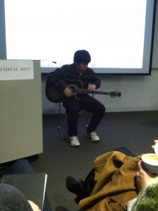
Saturday is paperwork day, just like Sunday is laundry day.  Inviolable.  I am OCD enough to know that if I break the schedule, the world will begin to spin backwards.  It’s a great motivator.

But today was SO beautiful outside that I carefully hid my pile of paperwork, AND the list of paperwork I had to complete, AND the research I needed to complete the paperwork on the list, and I headed out to look at art.  It was just me, about two million New Yorkers plus their out-of-town guests and their dogs.

Thanks to Andrew Ginzel who publishes a weekly log of gallery shows to see, I was armed with a list of five stops to make in Chelsea.  And beyond being delighted by the art, I experienced a couple of great surprises in the galleries.
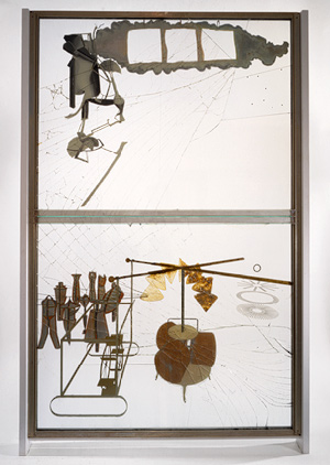
Joan Linder

Joan Linder

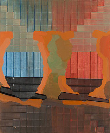
First, I went to Mixed Greens Gallery at 531 W. 26th Street (www.mixedgreens.com).  I hadn’t checked the exhibition ahead of time, I just like the people there and the space.  And it turned out to be a wonderful show of drawings by Joan Linder, whose meticulous and yet quirky mark-making brought the many views of her kitchen sink to life.  I turned to the woman at the front table and asked for a press release, and she turned out to BE Joan Linder!  So I got to talk to the artist and exchange business cards and express my real enthusiasm for her work.  She’s making hyperrealistic drawings as well as time-lapse drawings, and giving us a look at the endless constant mess of our kitchens and the frenzy that makes the mess over time.  They are beautiful and unique, but completely relatable.

Joan Linder

Joan Linder

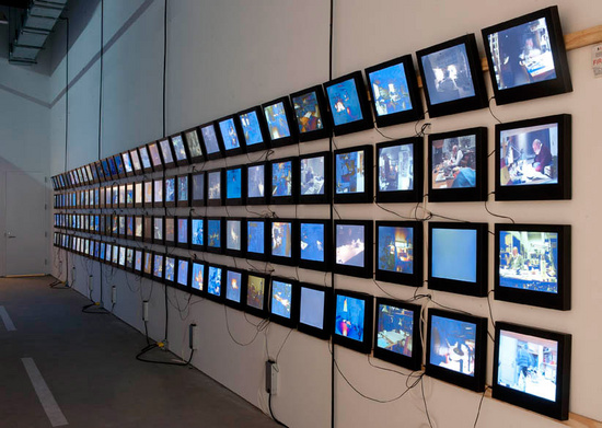
Then I stopped at Field Projects (526 W. 26th Street, #807) www.fieldprojectsgallery.com because Jacob Rhodes, one of the founders of the gallery, had been kind enough to visit my studio last week during Open Studios, and we had a good conversation about art and he left his card and suggested I submit to the gallery.  Notwithstanding the fact that he probably does that all day long, I was flattered.  So I went to his gallery today and enjoyed the group show that is up now, Show #13: Desaturated Rainbow.
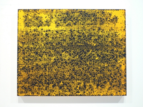
Feodor Voronov, Verse, and Adverse, at Field Projects

Feodor Voronov,
Verse, and Adverse,
at Field Projects

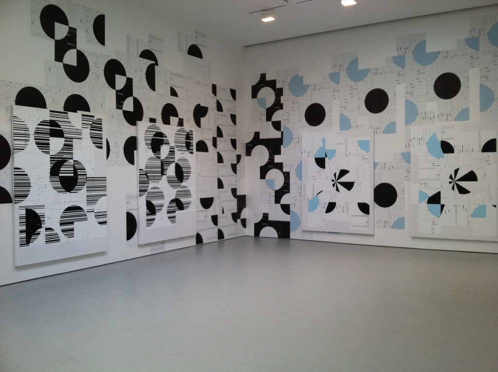
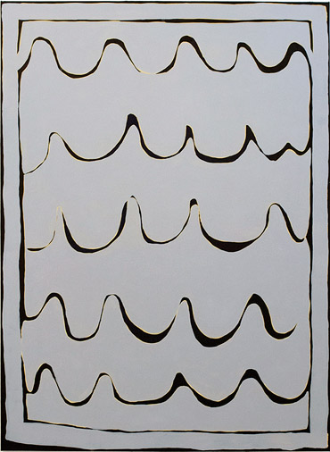
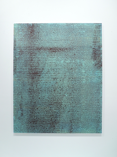
While there, I chatted with the other gallery founder, Keri Oldham and asked about a masking tape wall-installation by Heeseop Yoon that I found very reminiscent of work by my school-mate Minseop Yoon, who will graduate with her MFA this month.  Keri told me that the two artists are sisters, which is just cool.  I showed Minseop’s work in my post about the Affordable Art Fair, and her sister’s work is below.  Desaturated Rainbow is only at Field Projects until May 18, and you should make the time to go.

Heeseop Yoon

Heeseop Yoon

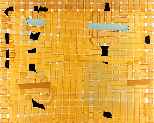
And because I couldn’t resist, I made a quick trip into Gemini G.E.L. at Joni Moisant Weyl (535 West 24th St., 3rd floor) www.joniweyl.com to see the John Baldessari show.  I am a fan of most of his work, but had never seen the series called Eight Soups that was on display.  With a nod and a wink to Matisse and Picasso, his bright colors are completely captivating, and the titles are very funny.  Definitely worth another look.

John Baldessari

John Baldessari

It was a great afternoon of good and unexpected art finds in the middle of all of New York City taking a walk.  Happy Spring!


No More Teachers, No More Books

Well, not exactly, since I’m planning on taking a Summer course that starts in a month.  Plus, I’m going to miss my teachers and my books.  Hmmm, maybe I should start over….

Today is the last official day of the semester, although we MFA candidates were finished on Saturday night with the end of Open Studios.  We had a good crowd, especially for our opening on Thursday.  Thank you to everyone who came.

Since my family was unable to attend, I am using photos of my studio here to give them an idea of the work I did this term.  If you’ve already seen it, scroll on by, and congratulations on a term well done.

The Drawing Center

On Wednesday I was lucky enough to receive a studio visit from curator Joanna Kleinberg Romanow of The Drawing Center (35 Wooster Street in Soho – www.drawingcenter.org).

Giosetta Fioroni, Liberty, 1965

Giosetta Fioroni

During our visit, Mrs. Romanow was insistent that I come to The Drawing Center to see their new show: L’Argento (Silver) by Italian artist Giosetta Fioroni.  So this morning I headed out and arrived as the doors opened at noon.  It is an exciting, exquisite exhibition that made me appreciate the mastery that hides behind the appearance of simplicity.  Compared to these drawings, mine feel overworked and over thought.  Compared to these drawings, EVERYONE’s feel overworked and over thought.  They are sublime.

This is a focused survey of works made in the 1960s, but some of Ms. Fioroni’s childhood work is on display, as well as some of the more abstract work that she began to make in the 1970s.  It is interesting to note that both of her parents were artists, thus providing her with a very precocious start, plus nature AND nurture.  Her gift was evident early on.

The show is open through June 2nd and The Drawing Center is very easy to reach by subway.  Do yourself a favor and go savor it.

I have spent most of this semester drawing rather than painting, and experimenting with left-handed self-portraits and silk-screening, so  Mrs. Romanow’s thoughtful and positive critique of my work boosted my confidence as I head into the last week of the semester.  If you’re in the city, come visit the SVA MFA Program’s Open Studios at 133-141 West 21st Street, floors 8-9.  We open Thursday at 5:00 and Friday and Saturday at noon.  http://public.sva.edu/evite/openstudios/

Ten Days and Counting

Ten days from today is my last (actually my only) final exam and the first day of this term’s Open Studios.  (invitation: http://public.sva.edu/evite/openstudios/)  Then my first year as an MFA candidate will be over.  One more year to go.  And will I have mastered the issues I’m struggling with in my art?  Will I have gotten any teaching or writing job offers?  Will I have managed to get rid of the growing pile of old art that sits in the middle of my small living room like a post-modern tepee?  I’m tempted to burn it, but I’d have to move my sofa and disable the sprinkler system and prepare for the fire department to arrest me… well, you see why the pile is growing.

Jiwon Choi, BFA Fine Arts Infinity as Dots, Black Infinity as Dots, White

Jiwon Choi, BFA Fine Arts
Infinity as Dots, Black
Infinity as Dots, White

My first year has been frustrating, exasperating, exhilarating, and did I mention frustrating?  I have not taken up drinking or smoking, but my language is admittedly saltier than when I first got here.  And sometimes I write it on the walls of my studio.  In big black letters.  My teachers push me hard to change what I’m doing.  It’s their job, and I appreciate the creative ways they torture me.  (More salty language.)  It’s time to take what I’ve learned this year and begin to plan the work I’ll make for my MFA exhibition and my written thesis. Time is fleeting.  (Does that make you think of the Rocky Horror Picture Show, or is that just me?  Is there a thesis topic hidden in there somewhere?  No.  No.  Stop it.)

Boyoun Kim, BFA Fine Arts, Printmaking Secret Pleasure

Boyoun Kim, BFA Fine Arts, Printmaking
Secret Pleasure


Boyoun Kim, BFA Fine Arts, Printmaking Summer

Boyoun Kim,
BFA Fine Arts, Printmaking
Summer

So the long explanation of why my blog posts have gotten a teensy bit scarce is that I’m busy biting my fingernails and getting ready for the term end.  In addition to my exam, I have two group critiques, term review by two strangers, and three days of sitting in my studio trying not to scare off the art-lookers who wander by.  They would really rather look in my studio when I’m not there, but what if one of them wants a conversation?  What if one of them is a curator?  Conundrum.  Maybe I’ll just loiter in the hallway as if I am a civilian and then pounce if they look interested.  That wouldn’t be creepy at all.

Michael Lee, BFA Fine Arts Castillo

Michael Lee, BFA Fine Arts
Castillo

But in the middle of anguish, there is always art.  Especially in New York.  Yesterday as I was headed into my studio building I noticed two new exhibitions on the ground floor.  Both were by undergraduates.  One was posters of movies made by the students in the digital art department.  And the other was a beautifully curated small show of BFA students from several different departments.

Ting Yu Tsai Interior Design Model

Ting Yu Tsai
Interior Design
Model

Deep breath.  Look at the art.  Admire the creativity.  Remember why I’m here.  And don’t lose my day job.


Affordable Art Fair

I wasn’t sure what to expect from my first Affordable Art Fair.  Was it going to resemble the “Starving Artists” shows that pop up at Marriott Hotels?  Would everything be sofa-sized? I read that prices at the show would range from $100 to $10,000.  Compared to  Sotheby’s auctions, these are indeed affordable prices, but $10,000 for a piece of art is still beyond most people’s budgets.

I did the math (2/3 of my art given away, 1/3 sold for a few hundred dollars each) and decided that this was a venue that might work for me in the future, if the qualifying process is not too onerous and does not depend on knowing the right people.  I not only don’t know the right people, I don’t even know who they are.

Overall, definitely worth a trip.  Also, only three blocks from where I live.  Win-win!

Student discount ticket and I was inside.  It definitely had that generic art show/coffee fest vibe, with movable walls and gallery signs, but I appreciated that the show’s color scheme was hot pink and white.  It said young and fresh!

Damien Hirst

Damien Hirst at Manifold Editions/Paragon Press

I was only three or four booths in when several paintings grabbed my attention.  Polka-dots in bright colors.  I could not possibly resist.  And who did they turn out to be by?  Damien Hirst.  I kid you not.  Practically the last man I expected to find at an Affordable Art Fair.  Okay, so they were woodcut prints in editions of 55 each, but they were signed by the artist and depending on the size could be had for a mere $2570 to $5040 apiece.  Including the frame.  I wanted one.  I wanted all of them.

Completely out of the question, of course.  If I had the cash, that isn’t how I’d spend it.  If I want to, I can paint my own polka-dots.  But how are ordinary “affordable” artists supposed to compete with big guns like that?

Minseop Yoon

Minseop Yoon

There were several artists from my own grad school program represented (more hope for me for next year), and I was especially pleased to see that Minseop Yoon’s art had migrated from the Emerging Artists area into Established Artists and was showing (and selling) in both spaces.  Good for her!


James Hawke at Bicha Gallery

James Hawke at Bicha Gallery

I was also interested to notice that most of the galleries represented were international, and therefore their artists were unknown to me.  But as usual, I was attracted to brightly colored paintings and resolved to make more brightly colored work, even though the group crit I endured right before rushing off to the Affordable Art Fair seemed to end in a concensus that my work wasn’t depressing enough.

Wouldn’t it be just dreadful if my work weren’t depressing at all?

Fear and Innovation

ShinYoung Park

ShinYoung Park

On Thursday, during our first-year Seminar class with Department Chair David Shirey, classmate ShinYoung Park played two avant-garde songs for us on his guitar.  He explained that most guitarists gain skill through practice and then are unwilling to innovate because they’re proud of their proficiency.  His playing included hitting the box of the guitar to add percussion, and picking out the melody on the neck with his left hand while his right hand damped the strings instead of strumming them.

The parallels to making art are obvious.  We artists gain skill and proficiency with certain techniques and then are afraid to try new ones for fear of failing.  Successful artists get boxed in to styles that sell, and galleries don’t encourage experimentation if they’re making money.

Piet Mondrian Windmill, 1905

Piet Mondrian
Windmill, 1905

Piet Mondrian Broadway Boogie Woogie, 1942-43

Piet Mondrian
Broadway Boogie Woogie, 1942-43

But fearless artists let go of what they have in order to grasp something new.  And when we look back at art-historical game changers, we probably don’t give them enough credit for overcoming the fear they must have faced.  After all, from where we sit all we see is success.  But we should remember the personal courage that is necessary to create innovation, and try to incorporate bravery into our art practice.  Me as much as anyone.  Maybe more.

Marcel Duchamp Portrait of the Artist's Father, 1910

Marcel Duchamp
Portrait of the Artist’s Father, 1910

Marcel Duchamp, The Large Glass, 1915-23

Marcel Duchamp,
The Large Glass, 1915-23

Back to the Galleries

Between Spring Break, Seasonal Affective Disorder, and really cold winds blowing off the Hudson, it had been a little too long since I toured the Chelsea Galleries.  Yesterday I set off with my friend and classmate Rachel to see a few shows.

Rachel was especially interested in the Dieter and Bjorn Roth show at Hauser & Wirth (http://www.hauserwirth.com/exhibitions/1649/dieter-roth-bjorn-roth/view/) which I discussed on February 5th, so we headed first to 511 West 18th Street.  I was happy to have a second look at the exhibition, and this time I was most impressed with the long wall of screens displaying Dieter Roth’s last work: the video documentation of his final year.  Plenty of artists live compartmentalized lives, in which the art is just one box.  Other boxes are filled with family, and outside jobs, and bills and pets, but Roth’s whole life was his art.  His whole life was art.

Dieter RothSolo Scenes, 1997-1998

Dieter Roth
Solo Scenes, 1997-1998

We next stopped in at David Zwirner (http://www.davidzwirner.com) to see what was new since the Francis Alys show came down.  A large installation by Michael Riedel was eye-catching, pleasing, and yet puzzling.  The exhibition is called PowerPoint and is based on repetitive images from digital processes.  Large canvases are hung on top of wallpaper with similar designs, and the huge graphic quality, plus the layers of information, attracted me aesthetically and intellectually, but left me emotionally cold.  It took me quite a while to figure out that perhaps this was the point.  That the computer age is powerful in repetition and reproduction, but not in personal connection.  I was reminded of how many of my Facebook friends are actually bare acquaintances.  Ultimately I was glad I had seen the show and felt its conflicting open space and claustrophobia.

Michael RiedelPowerPoint

Michael Riedel
PowerPoint

Finally we made it to Edward Thorp Gallery at 210 Eleventh Avenue (http://www.edwardthorpgallery.com) to see the group show Painting Advanced.  I was especially interested in seeing Gary Stephan’s work (full disclosure: Gary Stephan teaches in the SVA MFA Fine Arts program, although I will not be in his class until next Fall).  http://garystephanstudio.com

Gary StephanRickety Fields

Gary Stephan
Rickety Fields

I could analyze his paintings, and I did, but truthfully, they jumped off the wall and grabbed me.  The colors and shapes, the textures, the abstract/figurative dance all captivated me.  Some paintings don’t need dissection – good paintings.

Gary StephanUntitled

Gary Stephan
Untitled

In the same show I also enjoyed Rachel Malin’s work (http://rachelmalin.com), which reminded me a little of Cy Twombly’s scribbles, but are more colorful and restrained.

Rachel MalinTitled 40

Rachel Malin
Titled 40

Then it was time for a quick stop at Whole Foods (Chelsea being rich not only in art galleries, but also grocery stores) and back to our own work.

Happy Art!


Julia, Rachel, and Tiffany at the craft table

Julia, Rachel, and Tiffany at the craft table

All it took to make our first magical-return-to-childhood-crafts-night was cardboard picture frames, gaudy spray paint, glitter, macaroni, pompoms, and feathers.  We spread plastic sheeting and newspapers and then got busy.  For two hours or so we laughed and inhaled fumes and promised each other that we would always stick together.

Julia, Tiffany, Rachel, and George, hard at work(photo by Julia Buntaine)

Julia, Tiffany, Rachel, and George, hard at work

We had to explain to our foreign classmates that macaroni picture frames are an American tradition, even while we tried to figure out why.  And we had to reinforce the idea that when we make happy childhood crafts, there is no wrong approach.  Everyone wins.  Everyone gets an A.

ShinYoung, hoping his glue is drying

ShinYoung, hoping his glue is drying

Some of us made showy Vegas frames while others created Baroque masterpieces.  Some of us went “less is more” while most of us piled on the colors and the textures and waited impatiently for the Elmer’s to dry.

Julia's Masterpieces(photo by Julia Buntaine)

Julia’s Masterpieces
(photo by Julia Buntaine)

The glitter stuck to our hands while we debated holding a cardboard-picture-frame gallery exhibition.  And the whole time we were having fun we weren’t sad, and we weren’t anxious, and the satisfaction was in the making – not in the being appreciated for it afterward.

Tiffany, Rachel, George, me, (and Graciela's head) making "magical-return-to-childhood-crafts"

Tiffany, Rachel, George, me, (and Graciela’s head) making “magical-return-to-childhood-crafts” (photo by Julia Buntaine)

We proved that it is possible to create joy from thin air and a few bow-tie pasta (Farfalle!).  Next time, it was agreed, it will be popsicle sticks and yarn.  Join us and, if you’re lucky, remember when you were very young and things had not yet started to go wrong.

Art and Words

I’ve long thought of art as a visceral experience.  Stand in front of it, open your eyes, and you can’t not see it.  But language is entirely different.  Effort must be made.  Meaning must be pushed through a screen of words, like Play-Doh through a Fun Factory.  It comes out the other side and coalesces into more or less the same shape, but something is always lost, or changed.

Stephen MaineHP12-0402
Stephen Maine
HP12-0402

I like to write.  I like searching for just the combination of words that will convey what I mean with precision but also ease and fluency.  And I know that art critics are going through the same process when they write, but I have a lot of trouble understanding the more academic ones.  Perhaps I just don’t know enough of the insider jargon that exists at the core of any specialty.  I don’t understand surgeons when they talk amongst themselves, or pilots, or software engineers, either.

SVA faculty member/artist/writer Stephen Maine http://www.stephenmaine.com addresses this issue in the new edition of the Brooklyn Rail, with far more precision and fluency than I can.  His article, “Discourse ≠ Art” is all about the difficulties of discussing art – of applying words to art and hoping to create understanding. http://www.brooklynrail.org/2013/03/artseen/discourse-8800-art

Stephen MaineHP12-0505
Stephen Maine
HP12-0505

You should read the article yourself, but I am happy to report that it persuades me that good art conversation does not stray far from the art in question, and that good writing communicates better than bad.  That should be obvious to all, but it isn’t, and this article is both an excellent example and a much-needed reminder.