Making Paintings

Stuart Davis The Mellow Pad

Stuart Davis
The Mellow Pad

I’ve always had trouble making abstract art.  I admire the ability, but it’s difficult for me to overcome the delight I feel when I capture a likeness or represent what I see.  For me, abstraction isn’t easier than representation (the “my kid coulda done that” school of thought), it’s harder.

I love creating the illusion of space and depth on a two-dimensional plane.  Some abstract artists embrace the same challenge, and some work hard to avoid making any allusions to the natural world.

Jackson Pollock Number 8

Jackson Pollock
Number 8

In my second-year seminar class last week we read articles about Alfred Stieglitz, the ground-breaking New York Armory Show of 1913, and several of the artists working then. Not all artists are good writers (of course, not all writers are good painters), but Stuart Davis, a painter from that period explained abstraction in a way that makes the most sense to me.

Stuart Davis Swing Landscape

Stuart Davis
Swing Landscape

In his article, “Autobiography” (included in Diane Kelder’s collection Stuart Davis – Praeger Press, 1971), Davis discussed why he hated when viewers asked what his paintings were “about”.

“There is no simple answer to these pesky questions because in reality they are not questions about art at all.  They are in fact demands that what the artist feels and explicitly expresses in his work be translated into ideas that omit the very quality of emotion that is the sole reason for its being.”

He goes on, “In the first place let me say that the purpose of so-called “abstract” art is basically the same as all other art, and that it always has a subject matter.  In fact the difference between ‘abstract’ and ‘realistic’ art is precisely one of subject matter.  It would be more accurate to say that it is a difference of aspects of the same subject matter. The ‘abstract’ artist lives in the same world as everybody else and the subject matter available to him is the same.”

“…But the development of ‘abstract’ art has not been merely a matter of temperaments.  It is the reflection in art of that attitude of mind manifested in scientific materialism by which the world lives today.  Through science the whole concept of what reality is has been changed….  why should the artist be questioned for finding new realities in his subject matter?”

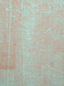
Stephen Maine HP12 - 0301

Stephen Maine
HP12 – 0301

Or perhaps in Hamlet’s words,

“There are more things in heaven and earth, Horatio,
Than are dreamt of in your Philosophy.”


My seminar class is taught by the wonderful abstract painter (and writer) Stephen Maine (www.stephenmaine.com). Here he is in an interview with Gorky’s Granddaughter discussing his paintings and his process.  If I could paint like he does, I might give up reality, too.

http://www.gorkysgranddaughter.com/2013/09/stephen-maine-august-2013.html


The Ubiquitous Celebrity of Lenin

The Propeller Group Monumental Bling

The Propeller Group
Monumental Bling

In a lovely example of synchronicity, I am suddenly surrounded by Vladimir Ilich Lenin.  When he was alive, being surrounded by him was rarely lovely, I believe.

First there are the readings for this week’s Seminar – about the Russian   Constructivists, Kasimir Malevich, and the government-directed art produced in Russia after the Revolution and World War I.

Lenin as Jay Gatsy

Lenin as Jay Gatsby in The Great Gatsby

Secondly, as I was hopping the galleries this afternoon I ran into Lombard Freid Gallery at 518 West 19th Street (lombard-freid.com).  Their new show by The Propeller Group is titled Lived, Lives, Will Live! which is based on a quotation from Kim Il Sung (founding dictator of North Korea) who said, “Lenin lived.  Lenin lives. Lenin Will Live.”

The exhibition shows Lenin as he might be viewed today – wearing bling, trying on new hairdos a la Leonardo diCaprio, and riding high on the global spin machine. Everything old is new again.

Lenin as Jack Dawson in Titanic

Lenin as Jack Dawson in Titanic

Which leads me to synchronicity part 3: the fact that I am just finishing rereading one of my favorite books: Lenin’s Embalmers by Ilya Zbarsky and Samuel Hutchinson.  This is the fascinating story of the decades-long job of the Zbarsky family to preserve Lenin’s body so that it could remain on display to the public. Their own lives were dependent upon pleasing Stalin for years, and then ironically they had to preserve Stalin (and Mao) as well.  Lenin is still on view in the former Red Square in the former Leningrad, but Kruschev had Stalin removed in disgrace and buried in 1961.

Lenin's body on display almost 90 years after his death.

Lenin’s body on display almost 90 years after his death.

Imagine going to Graceland and being able to see Elvis displayed in a glass coffin. After the creepy frisson down your spine, it might be kind of cool, in a Walking Dead kind of way.

I recommend The Propeller Group exhibition.  It is a very clever take on publicity, fame, and the kind of celebrity that lives on after death.  (Think Marilyn, or Ho Chi Minh – whose body is also preserved).

If you can afford a team of scientists working around the clock, year after year, just think of the wonderful legacy you too can leave.

Picasso Quiz

I was at MoMA yesterday with some out-of-town guests and every other New Yorker with his out-of town guests, when suddenly I found myself on a Picasso hunt.  It was right after I enjoyed a wonderful cheese-based lunch in the 5th floor cafe, which came right after I visited Andrew Wyeth’s Christina’s World and Balthus’ The Street while waiting for our table to be called.

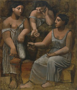
I may have mentioned before that I get lost in museums.  You can hand me a map, but unless I walk around with my nose in it, using a highlighter, I’m still going to get lost. So it was that at last I found myself facing Picasso’s Three Musicians on one side of a doorway, and his Three Women at the Spring on the other side.

Three Musicians

Three Musicians

Three Women at the Spring

Three Women at the Spring

Most artists are lucky and talented if they can do one thing well.  My best thing is actually traditional sculpture, but it exacerbates arthritis in my right thumb to work in clay, so I mostly do my second best thing, which is draw.  Looking at Picasso’s two works I was stunned by his range and his bravery at trying new forms of expression.  The important thing to remember is that no matter how arrogant he seemed, he couldn’t know that these paintings would work while he was making them.  That’s the bravery part.  And his limitless imagination encouraged him to start new phases over and over again during his long life.

Girl Before a Mirror

Girl Before a Mirror

The next Picasso I found is one of my favorites (because of the color): Girl Before a Mirror.  Then quickly I ran into Seated Bather, one of the scariest.  I started to hunt Les Demoiselles d’Avignon, perhaps his most famous painting, but never did find it.  Remember: lost!

Seated Bather

Seated Bather

Les Demoiselles d'Avignon

Les Demoiselles d’Avignon

I used to say that I admired Picasso but wouldn’t want to live with most of his paintings. After yesterday I think I would like to live with all of his paintings.  I could admire the genius and forget the misogyny.  And I haven’t even mentioned Guernica.  It is one of my mantras that no one can make anyone else’s art.  It is too personal.  There will never be another Picasso.

Here’s the quiz.  Can you look at the five paintings shown here and tell in which order they were painted?  Answers are below, but don’t peek yet.

Don’t peek.

Don’t peek.

Don’t peek.

Okay:

1907     Les Demoiselles d’Avignon

1921     Three Musicians and Three Women at the Spring (the same year!)

1930     Seated Bather

1932     Girl Before a Mirror

Unless you already memorized these facts for a test, I bet you got them wrong.  I know I did.  What an amazing brain Picasso must have had to not only paint these pictures, but in this order.  He was ahead of his own time, and I think must still be ahead of mine as well.


Jack the Ripper: Artist?

Walter Sickert, The Camden Town Murder

Walter Sickert,
The Camden Town Murder

One of my favorite British painters is Walter Sickert, whose life spanned the period from the Impressionists to World War II.  The son and grandson of artists, as a young man he studied with James McNeill Whistler and learned to paint alla prima.  For the rest of his life he painted only what he could look at, or see in photos.  Later, one of his students was Lucian Freud.

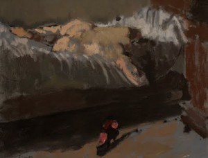
Study for The Camden Town Affair

Study for The Camden Town Affair

I was a little surprised, ten years ago, when mystery writer Patricia Cornwell accused Sickert in her book Portrait of a Killer: Jack the Ripper – Case Closed.  After years of admiring his work in the British Art Center at Yale, it took me awhile to get my head around the idea.  Then out of the blue Steven Sheehan, one of my painting teachers, said that “artists have always known” that Sickert was the Ripper.

Rose Shoe

Rose Shoe

The evidence is circumstantial.  Sickert was one of the Camden Town Painters – Camden Town being the location of the Ripper’s murders.  As he travelled back and forth to France, murders seemed to follow in his wake.  And most importantly, he established a strong connection to the police so that he was often the first person they called when a Ripper victim was found.  He was allowed into the crime scenes to draw the victims before the scenes were examined or cleaned.

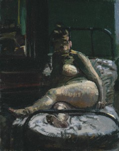
La Hollandaise

La Hollandaise

Whether or not Sickert was the actual Ripper or just obsessed with his crimes, he spent most of his life outside of conventional norms.  Would his paintings still be so well-known without the added frisson of murderous possibilities?  They are wonderful paintings, but most wonderful paintings are lost or forgotten 100 years later.

I have to admit that, based on nothing, I now think of Sickert as a murderer.  But does that indict all of us who are addicted to criminal trials, detective movies, and violent video games?  We may not be killers, but we enjoy the results of violent crime – perhaps too much.

Walter Sickert in 1911

Walter Sickert in 1911

I also have to admit that, when pushed, I try to access the blackest side of myself to put into my work.  We need light in order to see the dark, but it is the dark that fascinates us. So maybe Walter Sickert wasn’t a killer.  Maybe he was.  The possibility creates an edge of evil in paintings that might otherwise seem innocent.  Did having the soul of a killer improve his art?  If so, count me in.

I like happy books and happy music.  But I like brutal art.  And I’m working my way toward making my own art more sinister.

Jeff Koons?

Everyone (99.9% of whom have never heard of me) knows that I am in no legitimate position to criticize Jeff Koons.  He is a world-famous artist, singularly successful, with a broad imagination and remarkable productivity.

And yet, more than any other artist I can think of, he is held in contempt by much of the art world.  We all know that he doesn’t make his own art.  He has 50 or 60 or 200 Oompa-Loompas who fabricate his work, notably matching his numbered colors and polishing his shiny colored steel (not a double entendre).

Currently he is represented by all of the galleries in Chelsea.  Or at least it appeared that way to me as I headed west today to see his new work in two David Zwirner spaces (http://www.davidzwirner.com/exhibition/gazing-ball/), and his old work at Gagosian (http://www.gagosian.com/artists/jeff-koons).

Maybe it was just my perversity, but I was determined to like it.  And yet it wasn’t that simple.  Koons pretends that his work is easy.  That it is meant to reflect (pun intended) our current society and perhaps bring pleasure to the viewer.  That there is no subtext.  In this he is the rightful heir to Andy Warhol, inventor of the artist’s factory.

Balloon Venus (Magenta) 2008-2012 102 x 48 x 50 inches

Balloon Venus (Magenta)
2008-2012
102 x 48 x 50 inches

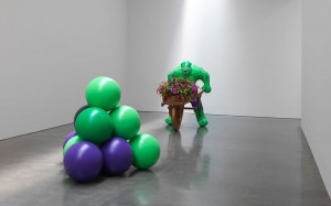
Part of what is confounding about Koons’s work is his complete transformation of his materials.  Or perhaps I should say, the way that what we assume we are looking at is never what we’re looking at.  The enormous balloon animals (Gagosian) look just like mylar but are powder-brushed steel.  And their incredibly smooth shapes were not achieved by a clown twisting hot-dog-shaped balloons, but were deliberately designed.  By Koons. The hot-pink nude woman who serves as the centerpiece of the exhibition is absolutely delicious.  Had she been made in clay or concrete or wood, we would all be admiring the cartoon twist brought to the reality of obesity.  Or maybe we would refer to fertility goddesses, or just admire the perfect balance of buttocks and belly with the ridiculous hairstyle she sports.

In the Zwirner show of new works, the star is the blue blown-glass garden ornament (which Koons refers to as a gazing ball) which appears as part of each otherwise all white oversized sculpture.  There are statues of Greek and Roman Gods, each with a gazing ball.  There is a snowman, who should be made of plaster like the other pieces, but instead is a fabric sculpture (with a gazing ball).  And a true kitsch masterpiece of a young boy (with a gazing ball).  Is he saying that we have managed to reduce all of Greek and Roman culture to garden gnomes?  No.  He is saying that in seeing our reflections in the blue balls (double entendre?  I’m starting to wonder) we stop to consider our own beings. Or something like that.  It was in the press release.

Is he making fun of us because we take this art seriously? or because we don’t? When the Incredible Hulk blow-up doll is actually a solid carving that weighs a ton, he has fooled us with his materials again.  I think it’s possible that he believes his work is serious, but he doesn’t believe that we know it.  So maybe he’s disdainful of us and how we can’t get past the deceptive and beautiful surfaces he creates.

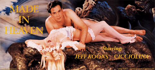
One of his biggest balloon pieces at Gagosian is a turquoise penis with blue balls (intentional double entendre, no doubt).  From behind it looks like the kind of twisted balloon swan that small children wear on their heads.  That is disturbing in concept but beautiful in the gallery.  There was a time in the past when he made pornography with his porn-star wife.  It was deeply personal art which he destroyed when the marriage fell apart and he lost custody of his son.  I don’t think we’ll see him delve below the surface like that again.  But what he does with his surfaces is mesmerizing and confounding.

Some people don’t like Jeff Koons because they think he thinks he’s smarter than we are. I’m beginning to think he might be.

Three Ball Total Equilibrium Tank Designed with the help of Nobel-Prize-Winning Physicist Richard Feynman

Three Ball Total Equilibrium Tank
Designed with the help of Nobel-Prize-Winning Physicist Richard Feynman


First, a Word From Our Sponsor

This blog is about art, and art school, and my boring life.  My medium is the English language, also French and Latin (stop laughing).  So I feel compelled to offer a few corrections of the current abuses of English that I hear around me.  If I don’t stop the madness, who will?

First, a factoid is not a tiny fact.  One tiny fact is the certainty that in your entire life you will never be further than three feet from a spider.  Try to live with it.  A factoid is really a tiny bit of misinformation.  In other words, a factoid is NOT a fact.  One common factoid: jeggings are slimming.

A small pronunciation problem: the word leeward.  It means downwind.  It is used in sailing and is also the name of a group of islands: wait for it … the Leeward Islands.  It is pronounced lou-ward, not lee-ward.  Impress your friends.

Here are two happy tiny language facts that always delight.  The plural of opus is opera.  No kidding!  And “heavy hitter” is a compliment in both baseball AND boxing.

But finally we come to the phrase that makes me want to tear my hair out.  No wait, New York salons are really expensive.  Let’s say it makes me want to cut off an ear, so I give it a Van Gogh award.  “The exception that proves the rule” is a ridiculous, nonsensical assertion.  The original phrase is “the exception that probes the rule,” which you can immediately see actually makes sense.

Please America (not all of whom subscribe to this blog, so discuss amongst yourselves) help me fix our common language.  We are not animals.  Your reward?  Next post: more pretty pictures!

Sikkema Jenkins & Co. – Go Now!

The headline show at Sikkema Jenkins Gallery (http://www.sikkemajenkinsco.com – 530 West 22nd Street) is Elizabeth Neel, whose work falls into several genres, each of which affected me differently.

one, 2012 Elizabeth Neel

One, 2012
Elizabeth Neel

First you find the small works on paper: acrylics and collages.  They are remarkable for so completely straddling the figurative/abstract line that I stood and looked a long time at all of them, trying to decide what I was looking at.  I always know that the longer I am compelled to look at a painting, the more successful it is.

Two Mules, 2012 Elizabeth Neel

Two Mules, 2012
Elizabeth Neel

In the second gallery are larger pieces.  There is a very big sculpture dominating the center of the space, which is surrounded by oversized oil paintings on the walls.  In the two-dimensional pictures, Neel has clearly used tape and overlays to make voids in her paint, creating a real sense of something missing: something for which we long, something that used to be there that we want to see.  Again, the mystery kept me looking.

The press release for the show referenced scientific principles as the inspiration for Neel’s work, but I have to say I didn’t understand the explanation.  Of course, it didn’t matter to me, because I was mesmerized anyway.

THEN, I wandered into the rear galleries to find a Kara Walker installation from 2010 that is being shown in New York for the first time, along with a new work from this year, Wall Sampler 1.  Long a fan, I have never seen Kara Walker’s work in person, and it was wonderful.

Kara Walker, 2010

Kara Walker, 2010

The larger work is The Nigger Huck Finn Pursues Happness Beyond the Narrow Constraints of your Overdetermined Thesis on Freedom – Drawn and Quartered by Mister Kara Walkerberry, with Condolences to The Authors.  It covers two walls and also includes small gouaches.  Ms. Walker’s work has always been controversial, with its brilliant use of the old-fashioned paper cameo to show us the ugliness of the American slave-owning past.  The cut-outs are human-sized and tell multiple stories about the imbalance of power and the frequent cruelty and rare kindness of that era.  They can be hard to look at, but even harder to look away from.

Knowing how difficult it is to access personal pain and then display it in one’s art, I admire Ms. Walker deeply for her bravery and talent.  Enough gushing?  I’ll stop now.

The two women showing at Sikkema Jenkins & Co. are making art on the razor’s edge.  Don’t miss your chance to see it all.  Both shows close on May 22nd.

The Review Panel

If you like art criticism, but wish there were more fisticuffs, then the Review Panel is for you. It’s like cage fighting for art critics.

Moderator David Cohen

Moderator David Cohen

Last night I attended the February meeting of the Review Panel, which is a monthly program sponsored by artcritical.com and the National Academy Museum.  Picture three critics on a dais, facing an audience of about 100, put on the spot by moderator David Cohen as they express their opinions of four current exhibitions.

It’s delicious to watch them disagree politely and deferentially while they deliver their barbed comments.  The loser is the one who ends up trying to defend an unpopular position after the legs have been pulled out from under it by the other critics. Will he crumple or maintain a brave front?

Moderator David Cohen (www.artcritical.com/author/David/) is a master of dry British understatement as well as editor and publisher of artcritical.com.  Last night he was joined by painter and critic Peter Plagens (www.peterplagens.com), artist and critic David Brody (www.david-brody.com/index.html), and critic Paddy Johnson (www.artfagcity.com/about/).

They reviewed the Francis Alys video Reel-Unreel, which I’ve discussed already, Diana Cooper’s show at Postmasters (ditto) and two other shows that I’ve already forgotten.  There were no fireworks, although first-time panelist Paddy Johnson was the minority vote on artists Diana Cooper and David Shrigley.  (Okay I lied.  I remember the show.  I just didn’t like it.)

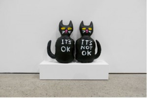
David Shrigley

David Shrigley

The first time I attended the Review Panel, there was a priceless moment when New York Times critic Roberta Smith told moderator David Cohen that he didn’t see enough art and was just “ignorant”.  It was a jab-cross-uppercut combo, although she did apologize later in the evening.

One of the best things about the Review Panel is the ability to see and hear articulate critics discuss emerging and established artists in plain English instead of artspeak.  If you miss the monthly event, go to www.artcritical.com to listen to the podcasts that are posted afterward.  You can also sign up for emailed reminders.

In the “real” world, art hardly matters, and art criticism matters not at all.  But anytime that thoughtful, well-educated people get together to talk, argue, and persuade is an event I don’t want to miss.


Completely Biased Review

Artist Andrea McGinty poses in front of one of her performance pieces.

Artist Andrea McGinty poses in front of one of her performance pieces.

I am not an art critic.  That’s why you don’t find negative reviews on this blog.  You can decide for yourself what you hate.  I want to tell you what I like and why.

Word Tree by Rachel Jantzi (detail)

Rob Campbell

Rob Campbell


Today I want to talk about a show you can’t go see.  Seven of my fellow students and friends have just installed an exhibition in a private space in Chelsea.  I watched them make this art in our joint studios and I wish it, and them, the best.


Sara Kriendler Installation

Sara Kriendler Installation


I also want to congratulate the company Tracx (which I think is a social networking data mining software company). http://www.tracx.com/news/exhibition-scientists-and-artists-unite.  They have chosen to use their working offices as gallery space, and this show is the first of what they foresee to be three new installations a year.  It’s good for their employees and clients to work with provocative art.  It’s good for the artists to be seen by new eyes.

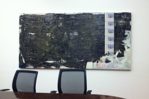
Anthony Donatelle's painting in the Tracx conference room

Anthony Donatelle’s painting in the Tracx conference room

I wish other companies would do the same.  Art in galleries is great, but there isn’t room in the galleries for everybody. There need to be other options.

Art Vidrine's Thread Painting

Art Vidrine’s Thread Painting

Denise Treizman's piece in the Tracx bullpen

a Denise Treizman piece in the Tracx bullpen


Maybe if you call Tracx (646) 448-5310 they will invite you to come up and look at the art.  I honestly don’t know. But this art is worth seeing. (104 W 27th).

Sharon Butler at Pocket Utopia

I stopped in at Pocket Utopia this afternoon (Sunday) and was lucky enough to meet gallery owner Austin Thomas when she had a few minutes to spare for me.  What a refreshing change she is from the gallery greeters who look through me, or worse, look directly at me with a sneer as if I’m wasting their precious and rarefied oxygen.  Why do they assume I’m not a collector?  I’m not, of course, but if I were, I would dress exactly the same.  Maybe even worse.

Sharon ButlerInstallation View

Sharon Butler
Installation View

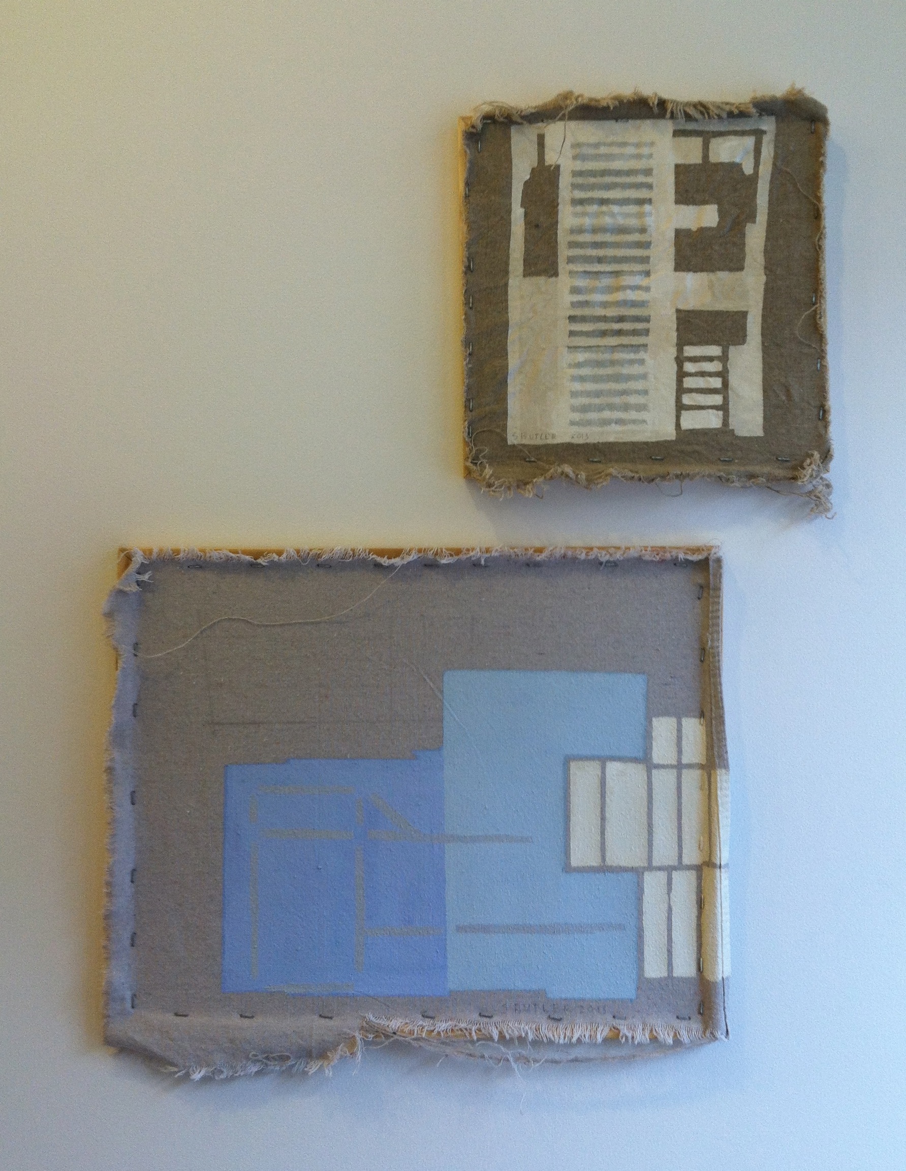
Sorry.  Off topic.  I went to Pocket Utopia to see Sharon Butler’s new show Precisionist Casual.  I first met Sharon last fall, when she came to SVA as a visiting artist and gave me a wonderful critique of my paintings.  I’ve always liked the images in her work.  They’re not pictures so much as schematics, or hints of pictures to come, or (my favorites) her subject matter distilled into clean lines, chalky colors, and subtle tone-on-tones.  They expertly straddle the line between figuration and abstraction.

Sharon ButlerParking Gate

Sharon Butler
Parking Gate

One more thing that makes Sharon’s art special is that it takes the question of art beyond subject matter, shape, and color and also raises questions of modernism and post-modernism while she plays with her painting supports.  Some paintings are on traditionally stretched canvases, but the staples are all showing.  Some paintings are on raw laundered canvas.  There are some on cheap canvas boards, and one in which the staples are on the wrong side of the stretcher bars.  There is even a pile of paintings leaning together against the wall. It’s quite deliberate, so what is she saying?  There are paintings which create space and others which do not.  And yet put on flat canvas versus dimensional stretchers, the space created becomes arbitrary.  She could remove it at any time.  So she is reminding us that painting is an illusion, and she, not you, is in control of it.

Sharon ButlerWasher, andBlue Fences

Sharon Butler
Washer, and
Blue Fences

The images are simple and engaging.  The titles are provocative.  The F train drops you practically on the doorstep.  So go.