Fear and Innovation

ShinYoung Park

ShinYoung Park

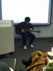
On Thursday, during our first-year Seminar class with Department Chair David Shirey, classmate ShinYoung Park played two avant-garde songs for us on his guitar.  He explained that most guitarists gain skill through practice and then are unwilling to innovate because they’re proud of their proficiency.  His playing included hitting the box of the guitar to add percussion, and picking out the melody on the neck with his left hand while his right hand damped the strings instead of strumming them.

The parallels to making art are obvious.  We artists gain skill and proficiency with certain techniques and then are afraid to try new ones for fear of failing.  Successful artists get boxed in to styles that sell, and galleries don’t encourage experimentation if they’re making money.
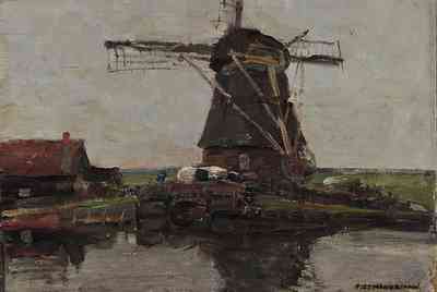
Piet Mondrian Windmill, 1905
Piet Mondrian
Windmill, 1905

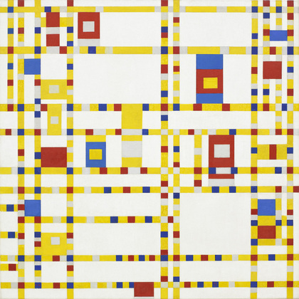
Piet Mondrian Broadway Boogie Woogie, 1942-43

Piet Mondrian
Broadway Boogie Woogie, 1942-43

But fearless artists let go of what they have in order to grasp something new.  And when we look back at art-historical game changers, we probably don’t give them enough credit for overcoming the fear they must have faced.  After all, from where we sit all we see is success.  But we should remember the personal courage that is necessary to create innovation, and try to incorporate bravery into our art practice.  Me as much as anyone.  Maybe more.
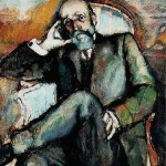
Marcel Duchamp Portrait of the Artist's Father, 1910

Marcel Duchamp
Portrait of the Artist’s Father, 1910
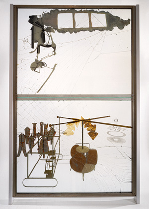
Marcel Duchamp, The Large Glass, 1915-23
Marcel Duchamp,
The Large Glass, 1915-23
Back to the Galleries

Between Spring Break, Seasonal Affective Disorder, and really cold winds blowing off the Hudson, it had been a little too long since I toured the Chelsea Galleries.  Yesterday I set off with my friend and classmate Rachel to see a few shows.

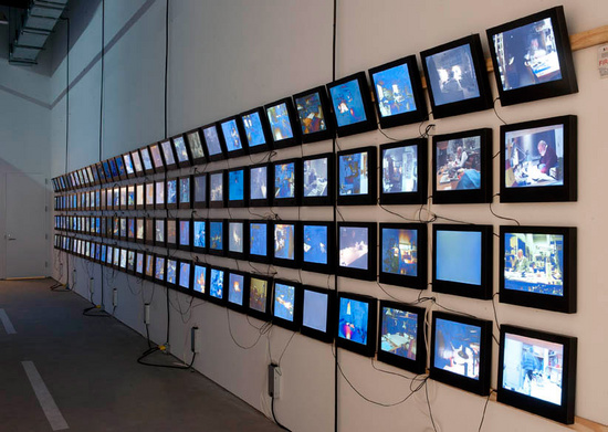
Rachel was especially interested in the Dieter and Bjorn Roth show at Hauser & Wirth (http://www.hauserwirth.com/exhibitions/1649/dieter-roth-bjorn-roth/view/) which I discussed on February 5th, so we headed first to 511 West 18th Street.  I was happy to have a second look at the exhibition, and this time I was most impressed with the long wall of screens displaying Dieter Roth’s last work: the video documentation of his final year.  Plenty of artists live compartmentalized lives, in which the art is just one box.  Other boxes are filled with family, and outside jobs, and bills and pets, but Roth’s whole life was his art.  His whole life was art.

Dieter RothSolo Scenes, 1997-1998

Dieter Roth
Solo Scenes, 1997-1998

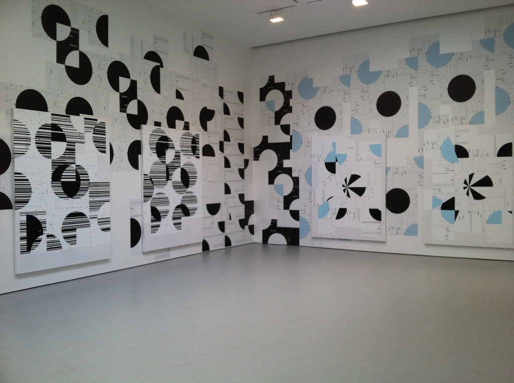
We next stopped in at David Zwirner (http://www.davidzwirner.com) to see what was new since the Francis Alys show came down.  A large installation by Michael Riedel was eye-catching, pleasing, and yet puzzling.  The exhibition is called PowerPoint and is based on repetitive images from digital processes.  Large canvases are hung on top of wallpaper with similar designs, and the huge graphic quality, plus the layers of information, attracted me aesthetically and intellectually, but left me emotionally cold.  It took me quite a while to figure out that perhaps this was the point.  That the computer age is powerful in repetition and reproduction, but not in personal connection.  I was reminded of how many of my Facebook friends are actually bare acquaintances.  Ultimately I was glad I had seen the show and felt its conflicting open space and claustrophobia.

Michael RiedelPowerPoint

Michael Riedel
PowerPoint

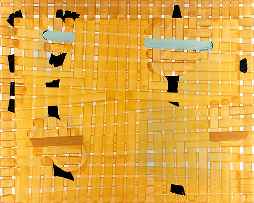
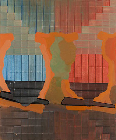
Finally we made it to Edward Thorp Gallery at 210 Eleventh Avenue (http://www.edwardthorpgallery.com) to see the group show Painting Advanced.  I was especially interested in seeing Gary Stephan’s work (full disclosure: Gary Stephan teaches in the SVA MFA Fine Arts program, although I will not be in his class until next Fall).  http://garystephanstudio.com

Gary StephanRickety Fields

Gary Stephan
Rickety Fields

I could analyze his paintings, and I did, but truthfully, they jumped off the wall and grabbed me.  The colors and shapes, the textures, the abstract/figurative dance all captivated me.  Some paintings don’t need dissection – good paintings.

Gary StephanUntitled

Gary Stephan
Untitled

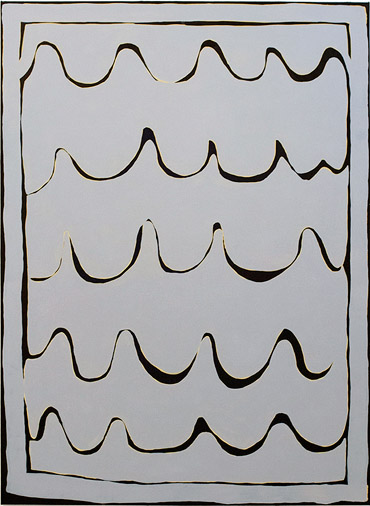
In the same show I also enjoyed Rachel Malin’s work (http://rachelmalin.com), which reminded me a little of Cy Twombly’s scribbles, but are more colorful and restrained.

Rachel MalinTitled 40

Rachel Malin
Titled 40

Then it was time for a quick stop at Whole Foods (Chelsea being rich not only in art galleries, but also grocery stores) and back to our own work.

Happy Art!


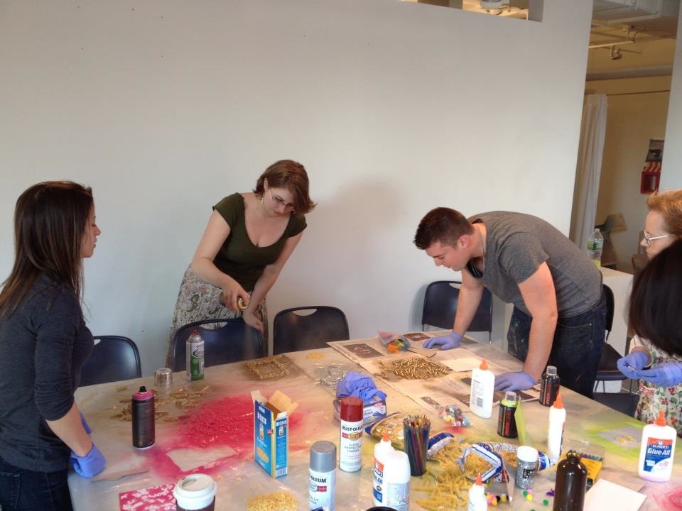
Julia, Rachel, and Tiffany at the craft table

Julia, Rachel, and Tiffany at the craft table

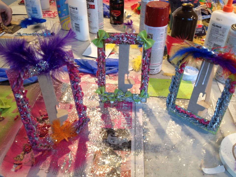
All it took to make our first magical-return-to-childhood-crafts-night was cardboard picture frames, gaudy spray paint, glitter, macaroni, pompoms, and feathers.  We spread plastic sheeting and newspapers and then got busy.  For two hours or so we laughed and inhaled fumes and promised each other that we would always stick together.

Julia, Tiffany, Rachel, and George, hard at work(photo by Julia Buntaine)

Julia, Tiffany, Rachel, and George, hard at work

We had to explain to our foreign classmates that macaroni picture frames are an American tradition, even while we tried to figure out why.  And we had to reinforce the idea that when we make happy childhood crafts, there is no wrong approach.  Everyone wins.  Everyone gets an A.

ShinYoung, hoping his glue is drying

ShinYoung, hoping his glue is drying

Some of us made showy Vegas frames while others created Baroque masterpieces.  Some of us went “less is more” while most of us piled on the colors and the textures and waited impatiently for the Elmer’s to dry.

Julia's Masterpieces(photo by Julia Buntaine)

Julia’s Masterpieces
(photo by Julia Buntaine)

The glitter stuck to our hands while we debated holding a cardboard-picture-frame gallery exhibition.  And the whole time we were having fun we weren’t sad, and we weren’t anxious, and the satisfaction was in the making – not in the being appreciated for it afterward.

Tiffany, Rachel, George, me, (and Graciela's head) making "magical-return-to-childhood-crafts"

Tiffany, Rachel, George, me, (and Graciela’s head) making “magical-return-to-childhood-crafts” (photo by Julia Buntaine)

We proved that it is possible to create joy from thin air and a few bow-tie pasta (Farfalle!).  Next time, it was agreed, it will be popsicle sticks and yarn.  Join us and, if you’re lucky, remember when you were very young and things had not yet started to go wrong.

Art and Words

I’ve long thought of art as a visceral experience.  Stand in front of it, open your eyes, and you can’t not see it.  But language is entirely different.  Effort must be made.  Meaning must be pushed through a screen of words, like Play-Doh through a Fun Factory.  It comes out the other side and coalesces into more or less the same shape, but something is always lost, or changed.

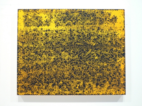
Stephen MaineHP12-0402
Stephen Maine
HP12-0402

I like to write.  I like searching for just the combination of words that will convey what I mean with precision but also ease and fluency.  And I know that art critics are going through the same process when they write, but I have a lot of trouble understanding the more academic ones.  Perhaps I just don’t know enough of the insider jargon that exists at the core of any specialty.  I don’t understand surgeons when they talk amongst themselves, or pilots, or software engineers, either.

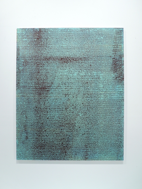
SVA faculty member/artist/writer Stephen Maine http://www.stephenmaine.com addresses this issue in the new edition of the Brooklyn Rail, with far more precision and fluency than I can.  His article, “Discourse ≠ Art” is all about the difficulties of discussing art – of applying words to art and hoping to create understanding. http://www.brooklynrail.org/2013/03/artseen/discourse-8800-art

Stephen MaineHP12-0505
Stephen Maine
HP12-0505

You should read the article yourself, but I am happy to report that it persuades me that good art conversation does not stray far from the art in question, and that good writing communicates better than bad.  That should be obvious to all, but it isn’t, and this article is both an excellent example and a much-needed reminder.

Art Blind

The crowds, the booths, the noise – I just couldn’t take anymore.  And if you think I’m talking about the 127 Art Fairs that sprung up in New York this week, you’d be almost right.  The truth is, I was art blind before the fairs opened.  I was saturated.  I couldn’t stand to look at any more anything.  I couldn’t have one more conversation about process versus content.  So although I should have gone to at least 113 of them, I didn’t.

Where DID I go?  Coffee Fest!  The coffee trade show at the Javits Convention Center.  Numbered booths, crowded aisles, overstimulation of my already overtired eyes; it might as well have been an art fair.  Or a gift show.  Or the GLBT convention with which it was sharing space (at least they had blow-up palm trees and colorful balloons).

IMG_0312

Trade shows are trade shows, I’ve decided.  And art shows are just as full of hucksterism and gritty commercialism as any other trade show.  There is no pretense that they are doing anything other than selling as much of their interchangeable inventory as possible.  No wonder the galleries don’t want the artists to come.

But back to Coffee Fest.  My sister Jennifer Cook owns a wonderful independent coffee shop in Katonah, NY (NoKa Joe’s – go visit.  She has a bookstore upstairs!).  And she needed to see what was new in coffee and coffee accessories, so I went along with her and her photographer/beekeeper friend Karen Sabath.

AND happened to arrive just in time for the finals of the Latte Art World Championship.  Proof that there is no escaping art.  The barristas impressively produced their championship cups in front of a live audience (try THAT Art Fairs!) and then we all got to sample the products (ditto!).  Coffee, tea, protein shakes, smoothies, scones, muffins, shortbreads, biscotti, and, oddly, lots and lots of oatmeal.

On the way out of the Javits Center, just in case you weren’t already buzzed from the caffeine and the sugar, there was a Starbucks doing bang-up business.  It was a perfect end to spring break.

Matisse at the Met

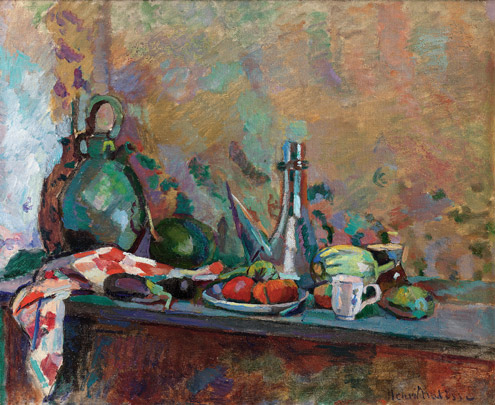
Still Life with Compote and Fruit, 1899

Still Life with Compote and Fruit, 1899

For years I have considered myself a Matisse-ophile, a mega-fan, an acolyte. So I’m a little surprised at myself that it took so long for me to get to the big Matisse show In Search of True Painting at the Metropolitan Museum of Art.

Once there I was surprised again to find that there were plenty of Matisses that I didn’t like.  Apostasy!

Still Life with Purro, 1904

Still Life with Purro, 1904

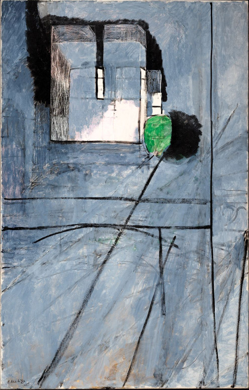
The show is cleverly organized by Rebecca Rabinow, Curator in the Museum’s Department of Modern and Contemporary Art, to show the viewer not just the amazing paintings, but the art-making struggle that Matisse undertook to make his masterpieces.  Two of the great revelations of the show (at least to me) are Matisse’s creation of multiple versions of the same painting at the same time, and his use of photography to evaluate the progress of the paintings he was making.

Notre-Dame, 1914

Notre-Dame, 1914

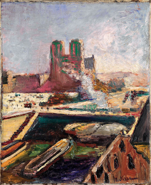
This is where I would like to make a cogent case for MY working process as similar to Matisse’s, with (of course) similar results.  But I can’t be so ridiculous.  The only comparison I’m comfortable making is that we both occasionally use photography, and I’m pretty sure my camera is better.

Notre-Dame, 1900

Notre-Dame, 1900

It is my personal preference that favors his still-lives and his interiors over his figure paintings, which seem to fall somewhere between Van Gogh and Picasso, but without the vibrancy that Matisse would achieve later with his cut-outs.  Plenty of people prefer the figures to the apples, but they are wrong (again I am kidding).

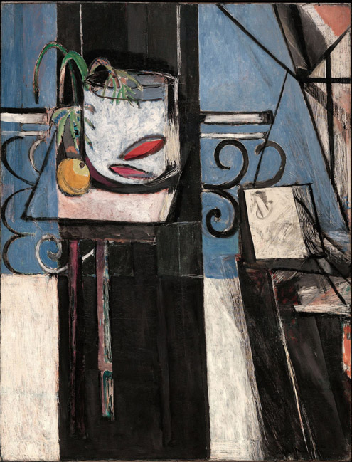
Goldfish and Palette, 1914

Goldfish and Palette, 1914

The show runs through March 17th, and if you haven’t seen it yet, you should. It takes up eight galleries on the ground floor of the museum.  Turn left when you enter the great hall, stop and pay, then walk forward through ancient sculptures and turn right when you dead-end.  I only give you directions because I think the Met moves walls in the dead of night just to confuse me on my next visit.  And you might want to drop bread crumbs so that you can find your way out later.  Just a suggestion.

Interior with Goldfish, 1914

Interior with Goldfish, 1914

The museum website on the exhibition is http://www.metmuseum.org/exhibitions/listings/2012/matisse/introduction, and Roberta Smith’s exuberant review can be read at http://www.nytimes.com/2012/11/30/arts/design/matisse-exhibition-at-the-metropolitan-museum-of-art.html?pagewanted=all&_r=0.

Split Ends

If it were a horse race, the SVA MFA Fine Arts candidates would win going away.

Sara Mejia Kreindler


Rob Campbell

Rob Campbell


Brian Whiteley

For reasons only slightly known, apparently having to do with booking the gallery, the thesis shows (the class is divided into two shows) are held in January and February before graduation.

Nick Fyhrie

David Jacobs


Naormi Wang

Emily Langmade


I’ve just had my first look at the second thesis show, Split Ends, and was really impressed by the quality of work, the ambition and scale of the installation projects, and how different it is from the first thesis show, We Object.

Feng-Tsung Chan

Feng-Tsung Chan


Dongsuk Lee

Dongsuk Lee

This exhibition is primarily installation, sculpture, and video, while the first show was dominated by painting, drawing, and other flat media.

Keith Hoffman


Anna Costa e Silva

I’ve seen most of the Split Ends work develop over the year in the studio, and it is remarkably different when presented in a gallery – transformed by the space, and transforming the space in turn – in a way that doesn’t happen with paintings.

Kwantaeck Park

Part of that comes simply from having to unmake, move, and then remake found-object sculptures and assemblages.  Part of it is that in a new space the artist makes new decisions, again in a way that is unlike paintings.

Jamie Sneider


Denise Treizman

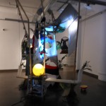
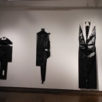
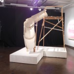
This show has dramatic lighting, lots of recorded voices and soundtracks, and impingement of art pieces on one another.  Or is that infringement?  Or collaboration?  In any case, it creates energy and a show that is worth experiencing.

The Visual Arts Gallery is at 601 West 26th Street, 15th Floor, and the exhibition remains up until March 9th.

Ates Ucul
Ates Ucul


Matthew Eck
Matthew Eck
Marc Bradley Johnson