Color Shift
Installation View at
Mixed Greens
I have friends who love new people. They are true extroverts. Secretly I hate them. No, of course I don’t. But I’m jealous. They make it look so easy, so fun. New people. Yay! Let’s talk about art! Let’s talk about you! Let’s talk about me!
I am old enough that I have learned how to meet people, and speak to groups, and discuss my work and my background. And I am truly interested in others, their opinions, and their lives. But it’s difficult for me. I’m an introvert and sometimes the right words won’t come.
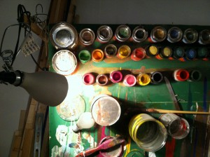
I like to think that when artists, or experts, or even my own faculty come to visit me in the studio that I handle it gracefully, and that panic does not plug my ears past the point of hearing what caring people say to me in the genuine hope of helping me and my work progress. And that hearing them, I respond appropriately, without ego, to gain the most from their visit. I like to think that.
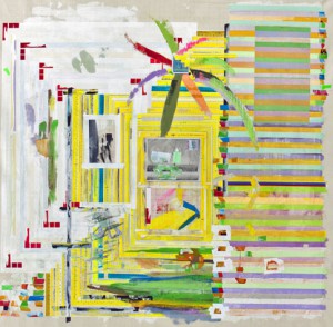
Yellow Rules White and Red
Franklin Evans, 2012
I would like to thank Kathleen MacQueen, art critic and writer of the column Shifting Connections (http://shiftingconnections.com) who visited me a couple of weeks ago. Her insights on my use of multiple versions of the same image were extraordinarily helpful. And last week artist Franklin Evans (http://www.franklinevans.com), whose work I admire, also visited me and helped me with a sticky issue I was facing about layering images and hiding meaning in pattern.
We Have Pictures Because We Have Walls
Arabella Campbell
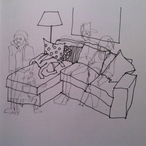
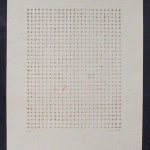
On Wednesday, I was lucky enough to receive a visit from Heather Darcy Bhandari, Director, and Courtney Strimple, Exhibitions Coordinator, from Mixed Greens Gallery. http://mixedgreens.com/exhibitions.html From them I learned that I was doing some things right, but that I should have edited the work I had on display. And there were other things that weren’t working, like the black-line drawings that underpin many of my iPad sketches.
Heather Darcy Bhandari is also the co-author of the invaluable book Art/Work, which is used as a text in business of art classes and serves to clue in clueless artists about how the gallery world works and how we should behave in it. One cannot possibly overestimate how clueless we are.
Matthew De Leon at Mixed Greens
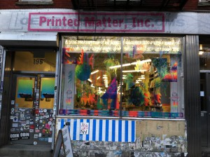
Window Dressing
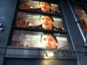
All of which is my incredibly roundabout way of getting to the point that yesterday, having walked in pelting hail to the SVA Gallery on West 26th to drop off an application-for-exhibition package, I found myself looking up at the Mixed Greens exterior, whose windows are currently displaying enormous photographs of Andrew McCarthy from the movie Mannequin. I will not admit that it lingers quite strongly, but I used to have SUCH a crush on Andrew McCarthy. The narrative behind the window installation is meaningful (check it out on the website), but it needn’t be since the visual image alone is quite powerful.
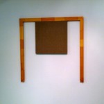
Zachary Dean Norman at Mixed Greens
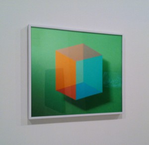
Platonic Solid #2
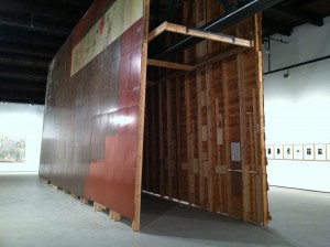
Inside the gallery I was at first put off by the simplicity of the space and the spareness of the group show currently on display. But I wandered around and looked more closely and slowly began to get it. The art is about art. In the simplest possible way it makes its point that we in the art world spend a lot of time talking (and writing) about art, but the bottom line is looking at it and seeing what it says without words. It is a very witty show, which grows on you as you walk until you’re smiling at the walls.
I want to thank Mixed Greens for providing images on their price lists. And prices, actual prices, for art work that is for sale.

Sherwin Rivera Tibayan at Mixed Greens
Installation View #2 (MoMA, Blue Monochrome, 1961, Yves Klein)
I am very grateful to the artists, and experts, and faculty who come to my studio to help me make better art, probably not knowing that I am quaking with fear inside. If I wait too long to answer you it is because I am afraid and because I get stuck in my right brain, where there are no words. So let me say it here: your visit means the world to me.